Output Preview •
Outputs were the moment everything built in SCOPE Better became a document a client could actually read. So when the output tool was cluttered, confusing, and had a preview feature that didn’t work. This wasn’t a small problem; it was undermining the value of everything that came before it.
DISCOVERY
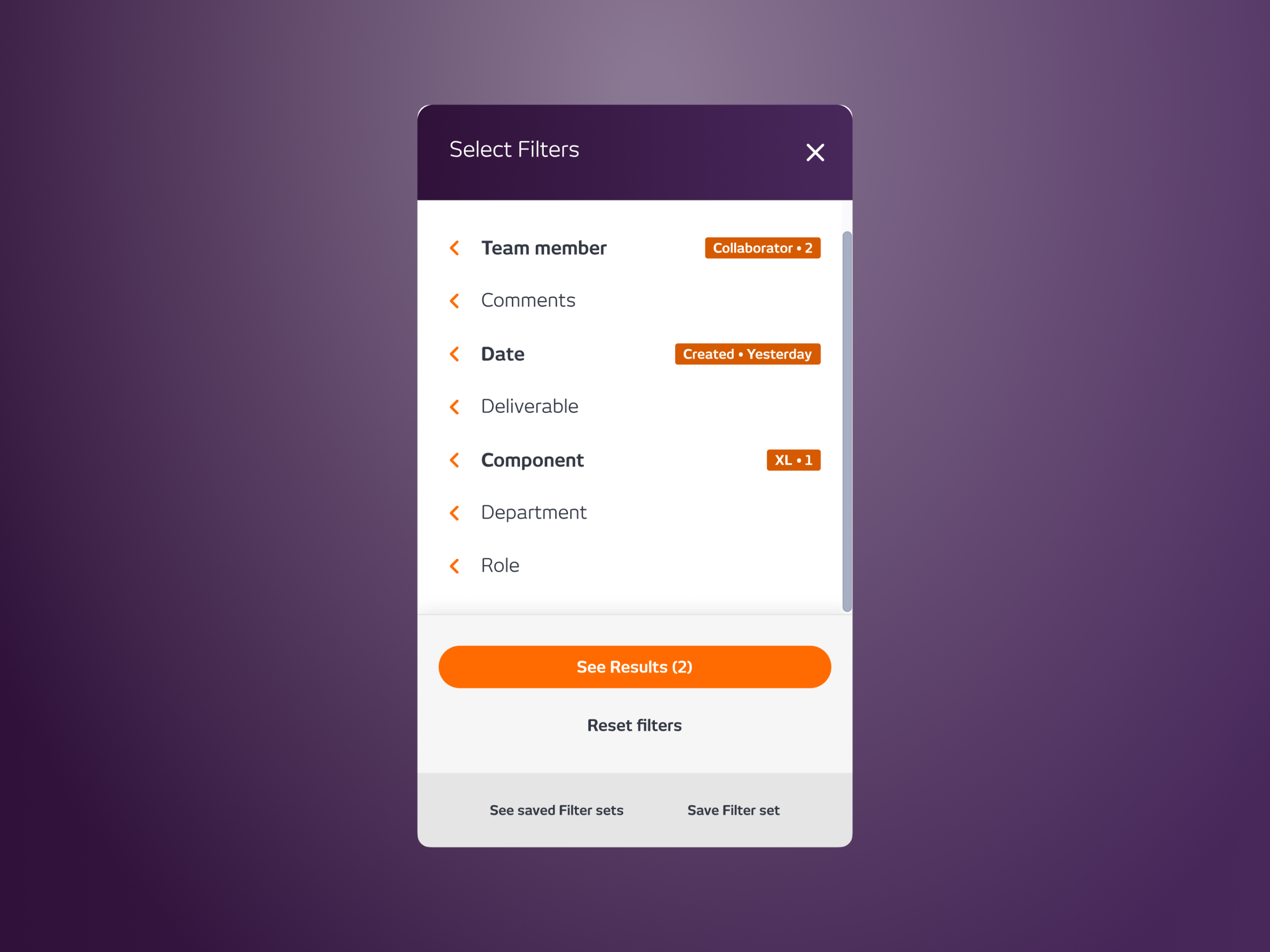
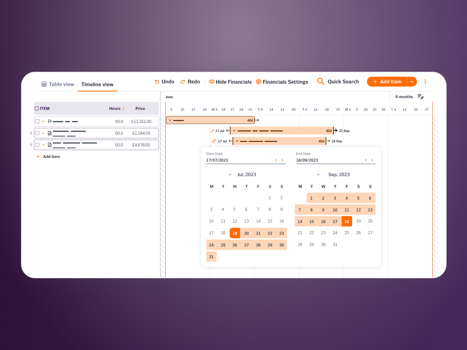
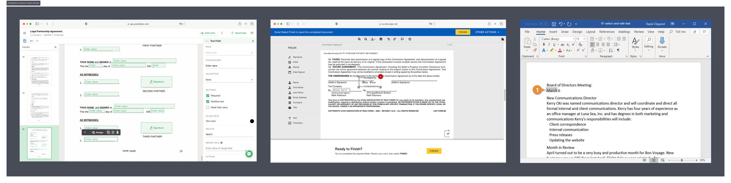
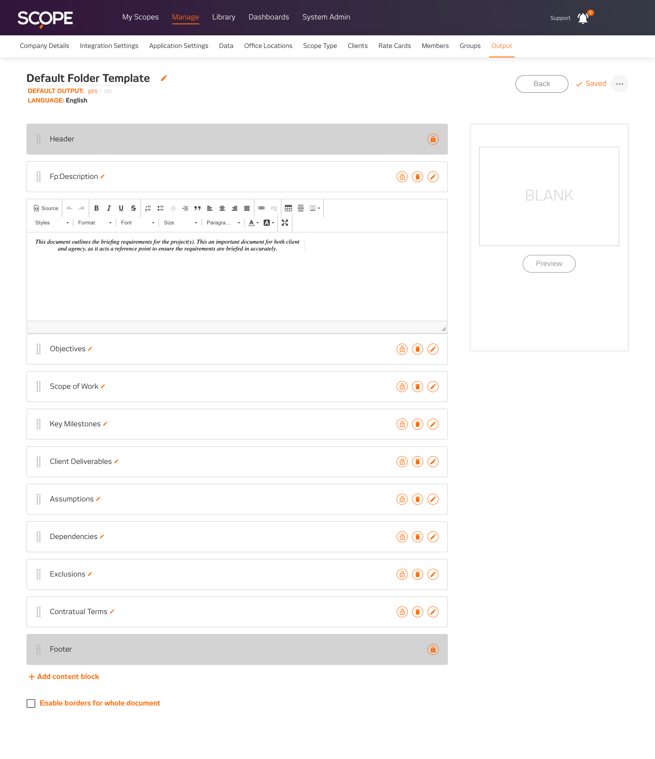
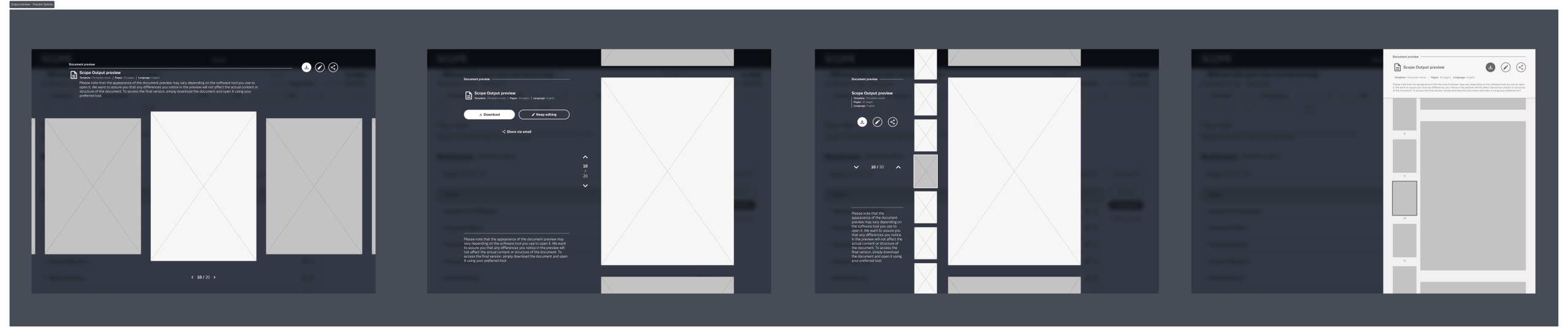
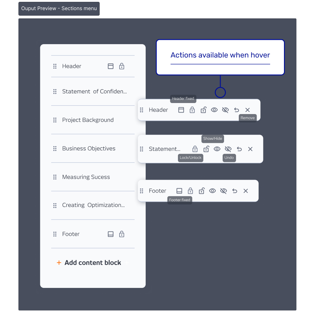
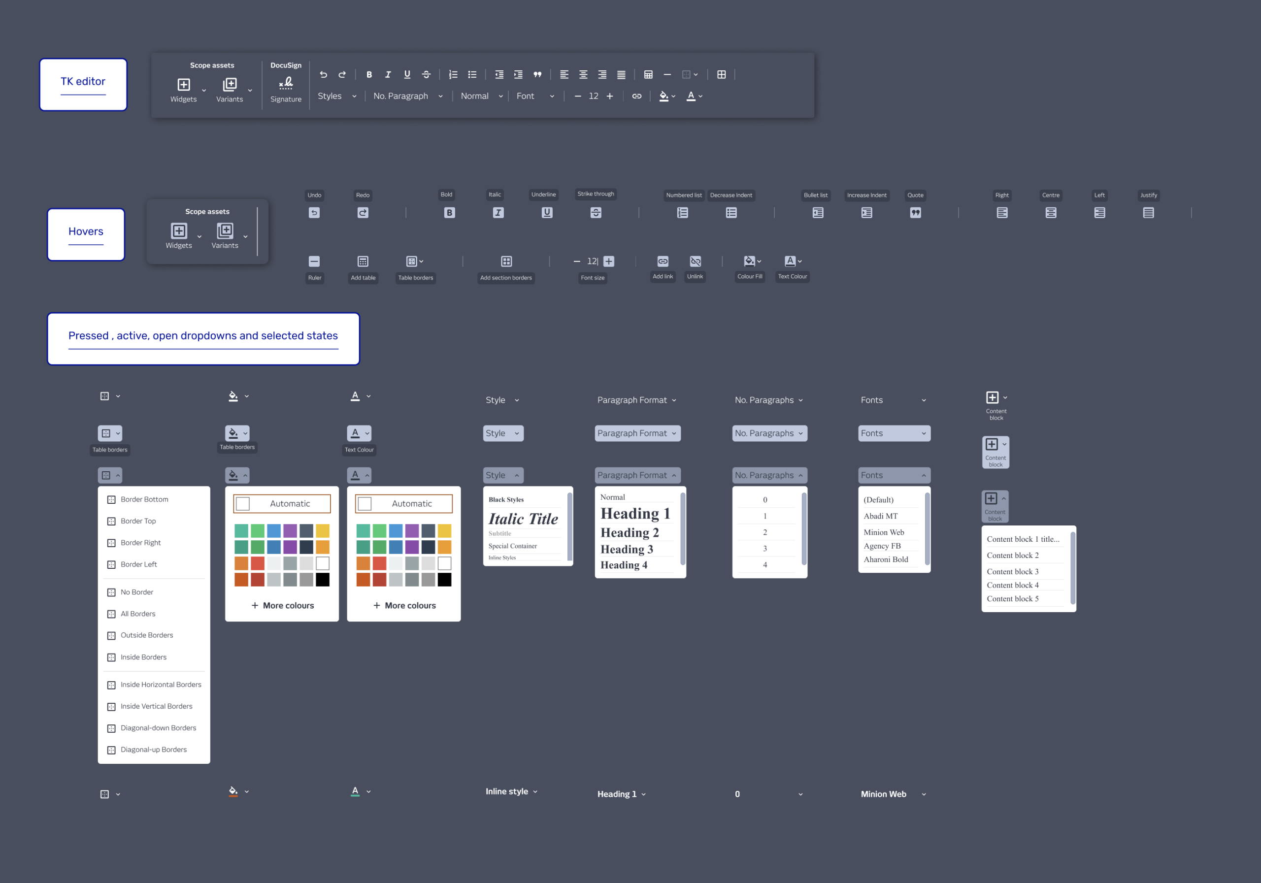
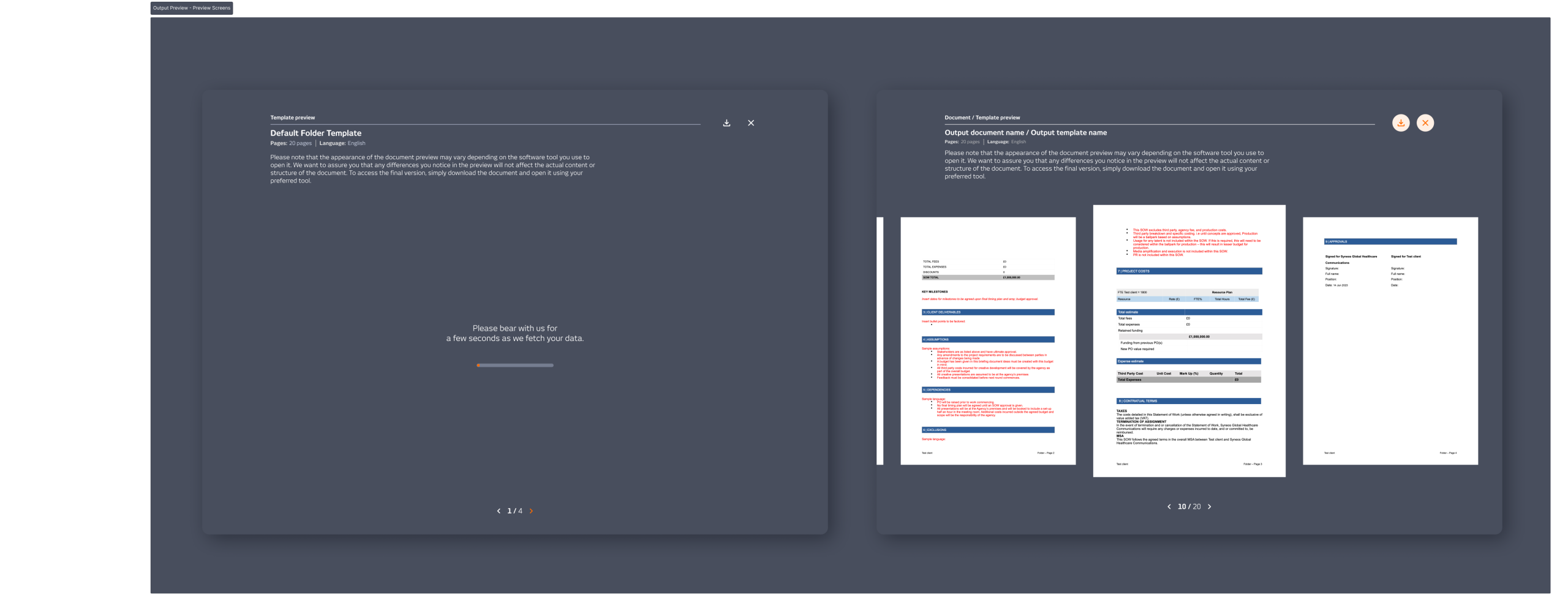
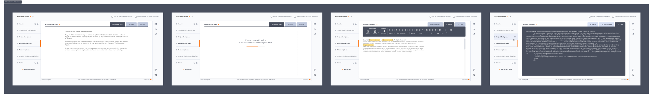
The existing tool was a neglected MVP. Sections stacked in vertical dropdowns, a cramped editing area, rich text tools hidden behind shortcuts nobody remembered, and a thumbnail preview showing placeholder images because the system wasn’t generating them. DocuSign and PandaDoc were the reference points; both had solved the same problem cleanly: navigation on the side, a large working area, and a clear moment to preview before export.
WHAT I DID
I designed two versions to give stakeholders a real choice. The Simple version improved what was already there without restructuring it. The Combined version moved sections to a sidebar and gave the editing area 80% of the screen, a Word-style layout users already knew how to use, with a full document preview before export. We went with the Combined version.
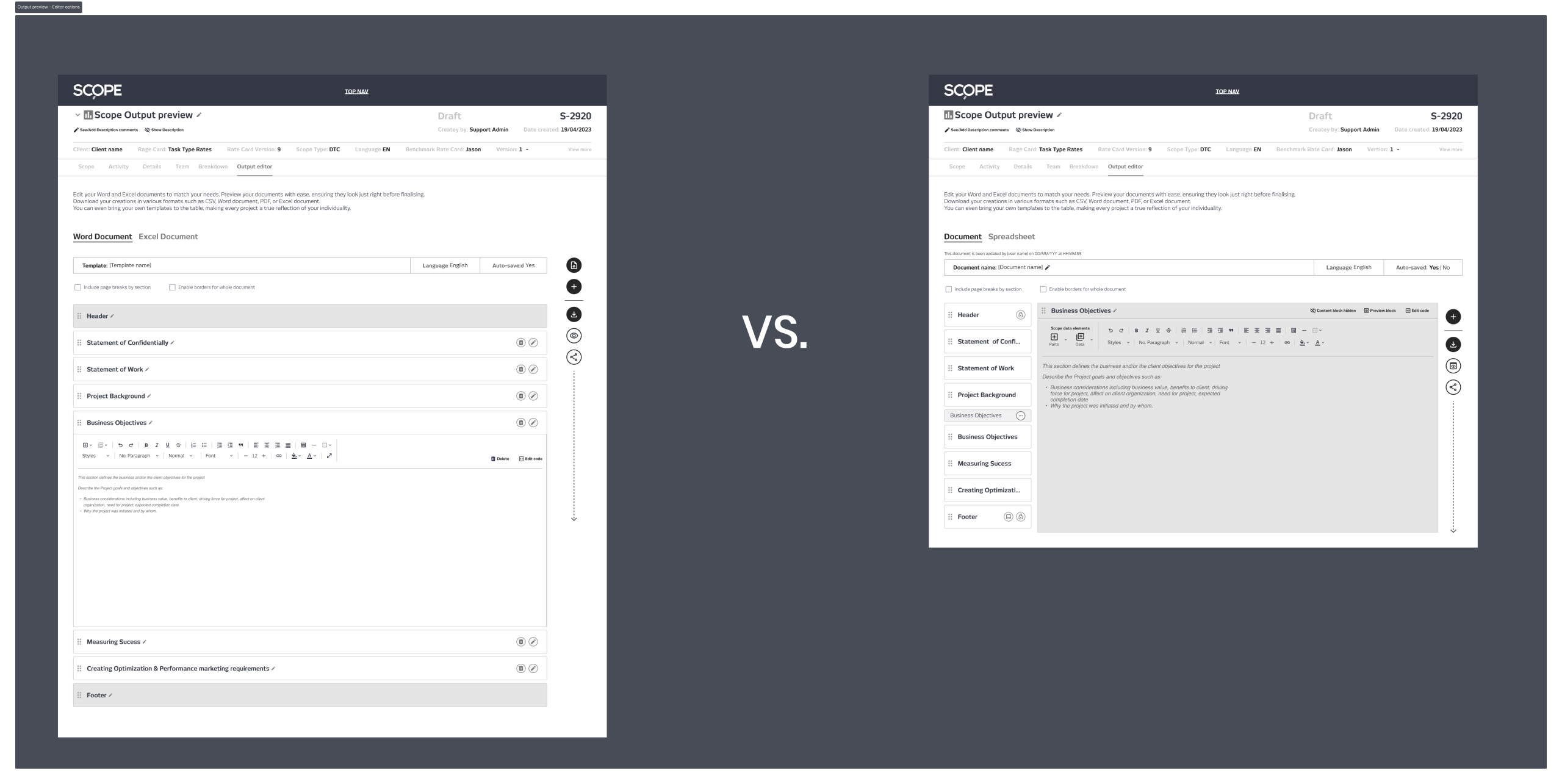
The rich text toolbar was rebuilt around the tools users actually reached for, identified through support ticket data from the customer support director. The editor shipped completely while I was still finishing the wider designs.
One stakeholder flag came in mid-process: the template name had been replaced by the scope name, and the change template option was buried too far down. Both were fixed before handoff.
OUTCOME
The redesign shipped and was well received. The Word-style interface needed no explanation. The only consistent feedback was that it felt slow, a system performance issue, not a design one. Outputs went from one of the most complained-about parts of the platform to one of the most valued.
Company
SCOPE Better
Year
2024
Design Tools
Figma and Miro