Undo / Redo •
Undo and redo are so basic that most users don’t think about them until they’re gone. SCOPE Better fallback was the browser’s back and forward buttons, which were unreliable and didn’t understand the platform’s state. It had been on the to-do list for a while. I pushed to make it a priority. ⤵
DISCOVERY
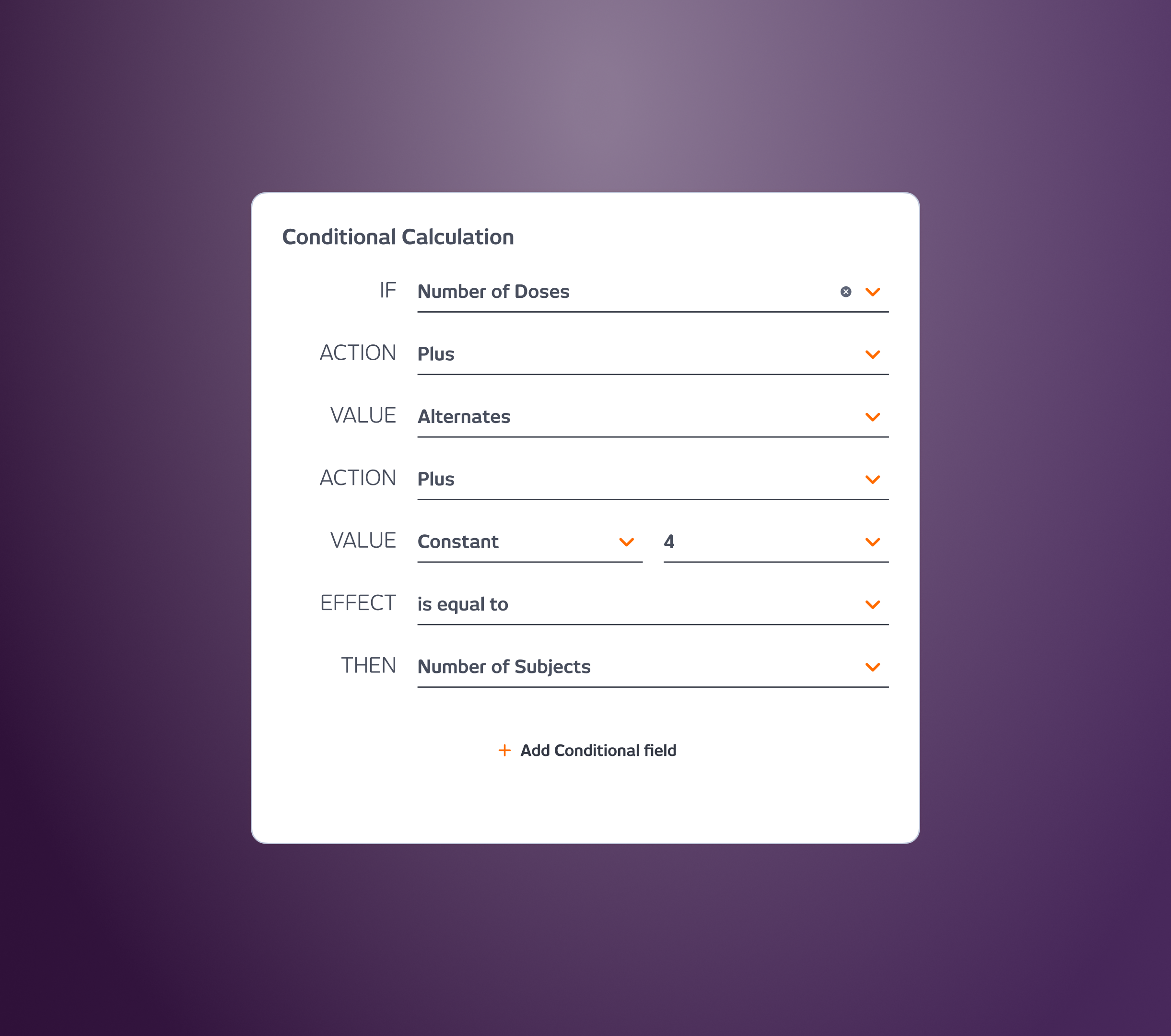
The need came from two directions: user complaints about accidental edits with no safe way back and my own audit of the platform, where the absence of undo/redo was an obvious gap against basic usability principles. Users should have control and freedom. Getting into an unwanted state with no way out creates frustration and erodes trust in the product.
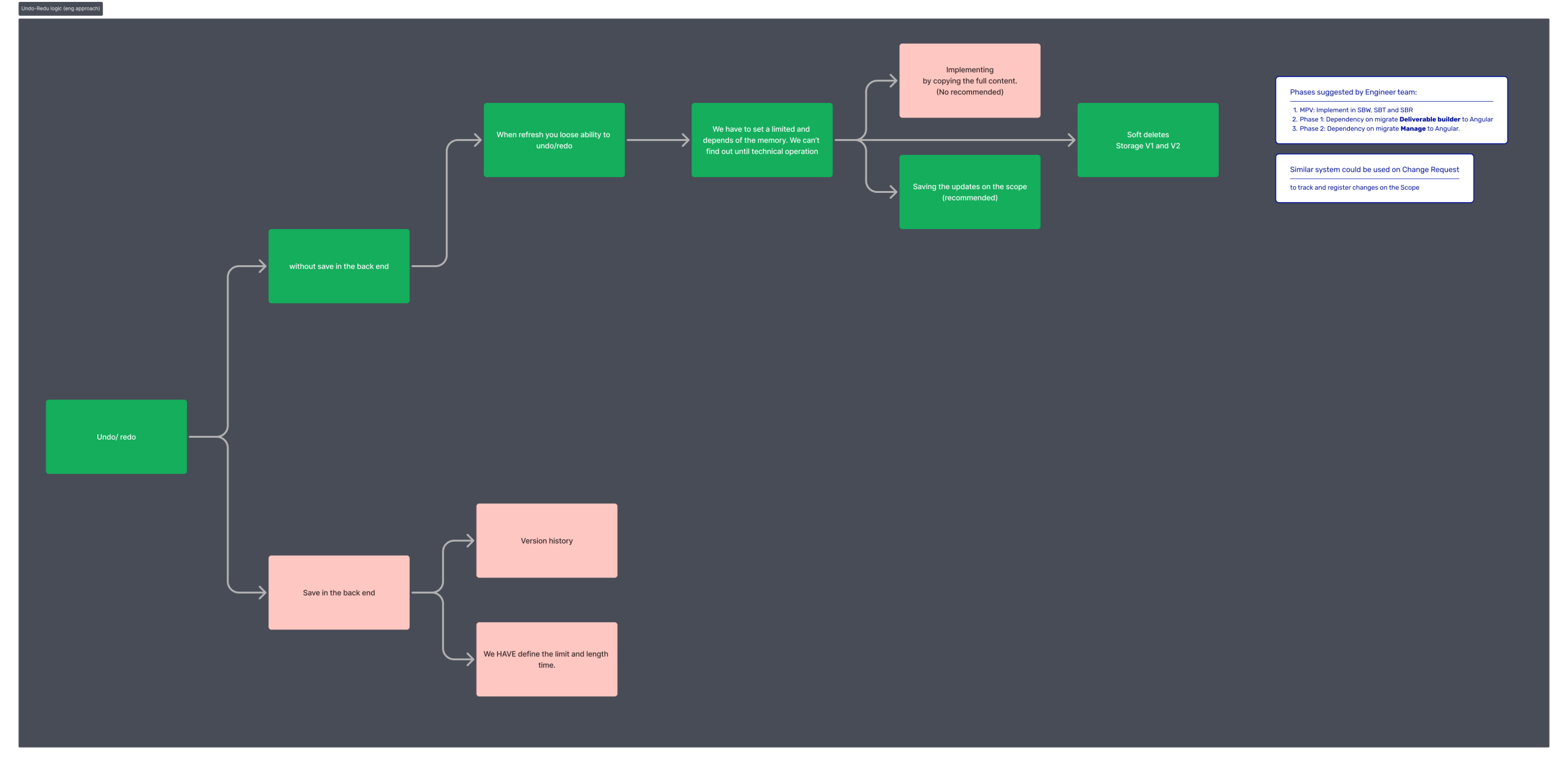
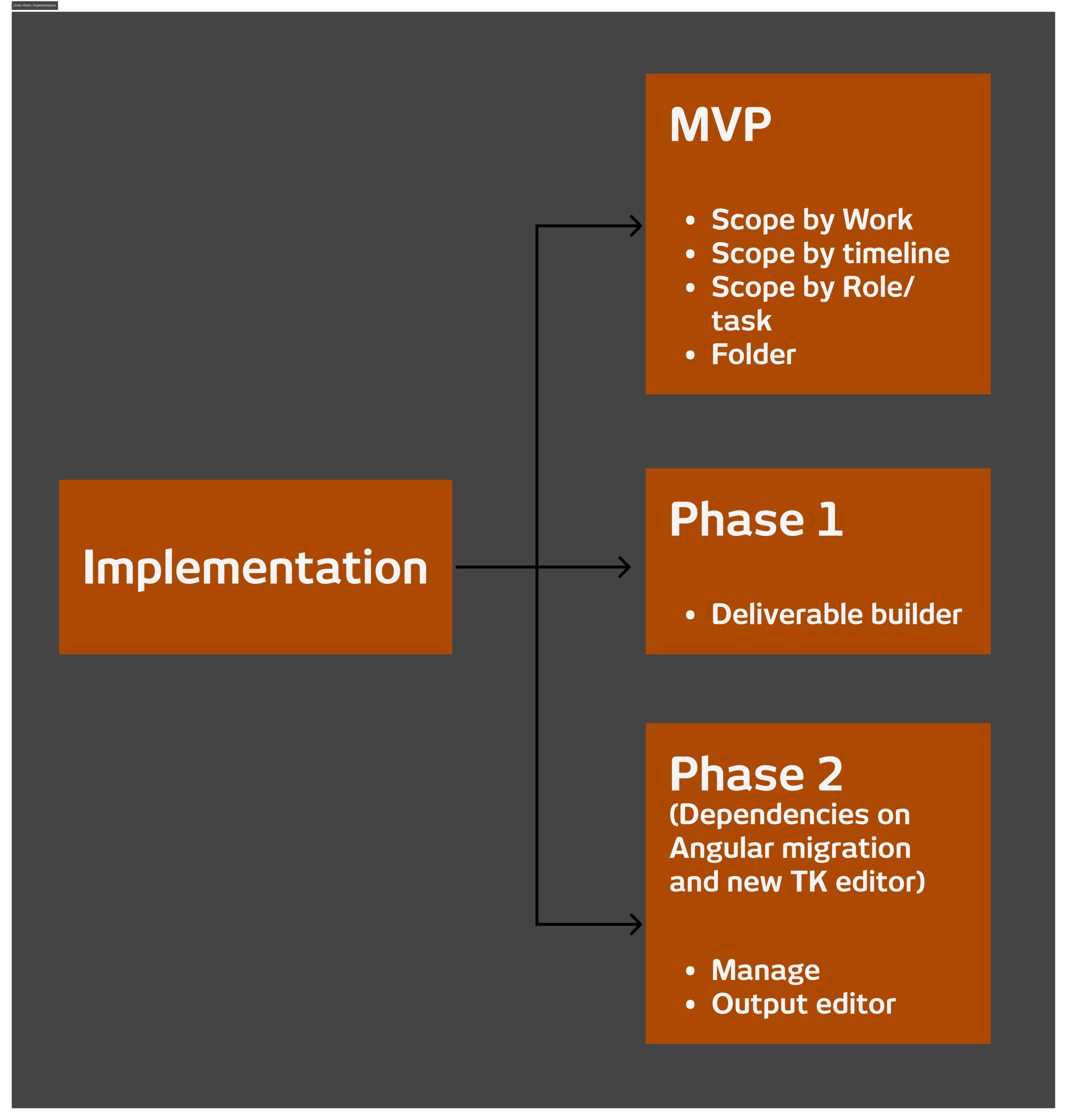
I sat with the engineering team to assess the effort, define the fastest viable implementation path, and map the logic. There were dependencies to navigate, the Angular migration and the new rich text editor in the Output preview both had to be factored into the rollout sequence. The engineering team proposed a phased approach: MVP covering all three ways of scoping ( by work, by timeline, and by role) followed by two further phases tied to the Angular migration of the Deliverable Builder and the Manage section.
WHAT I DID
I mapped the full logic of undo and redo states across the platform and designed for the phased rollout, making sure the MVP was coherent on its own while leaving room for the later phases to extend it consistently.
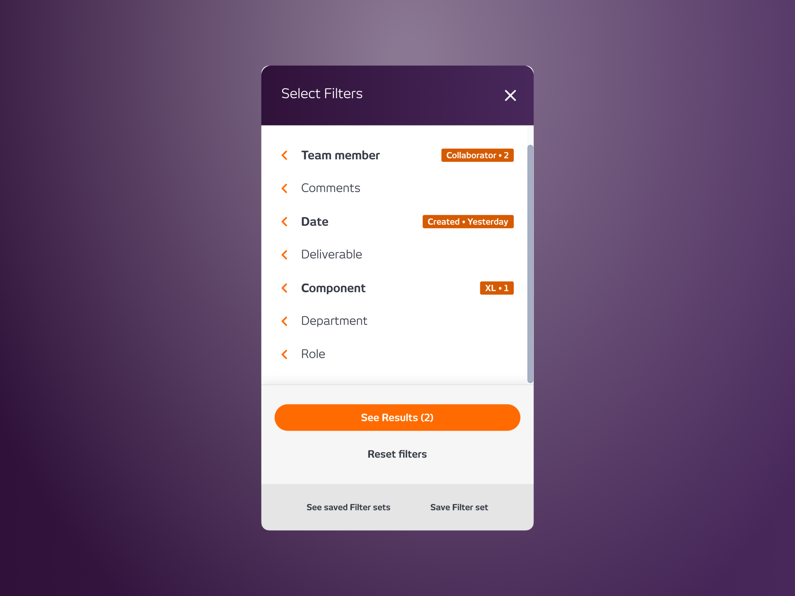
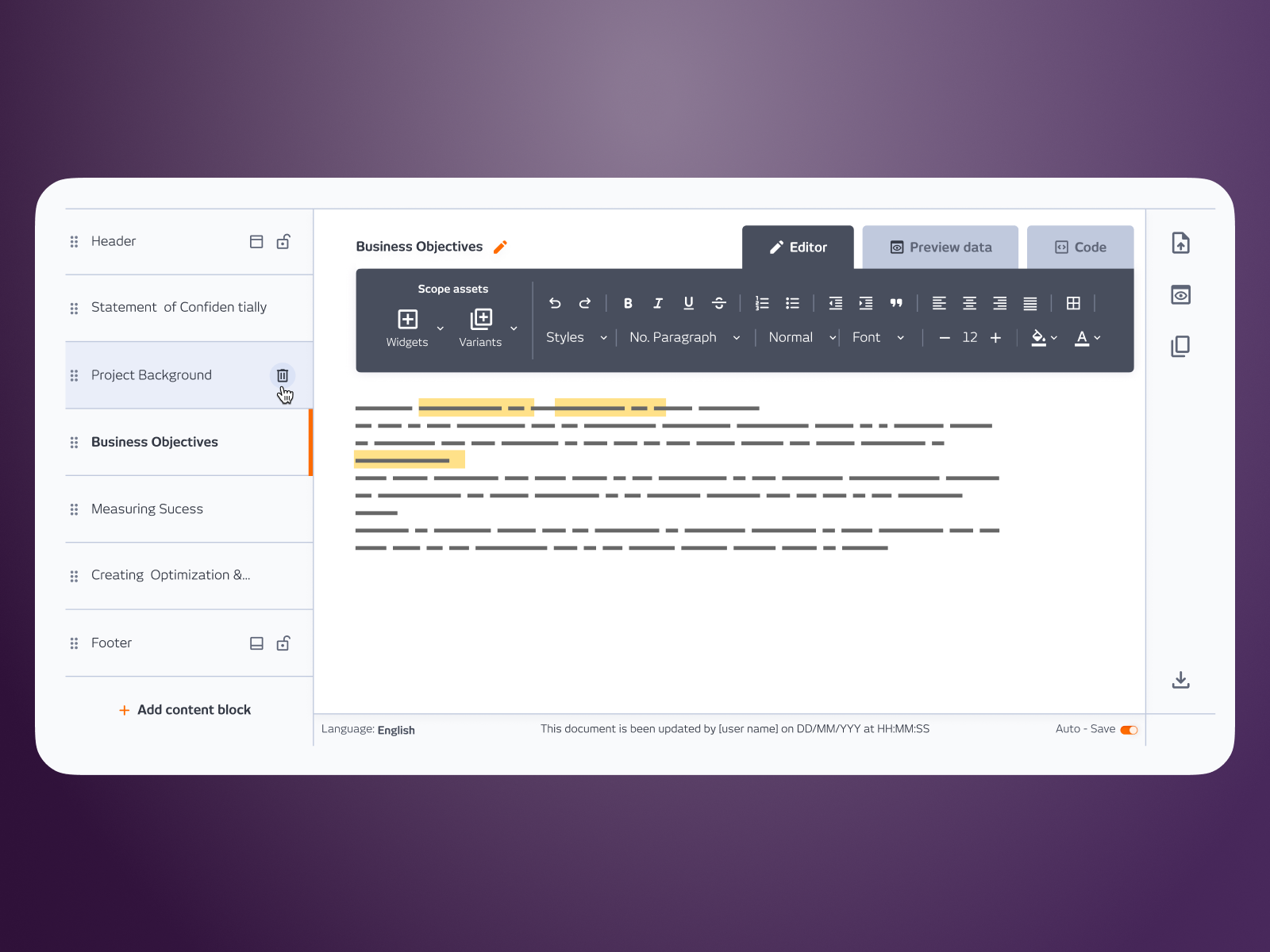
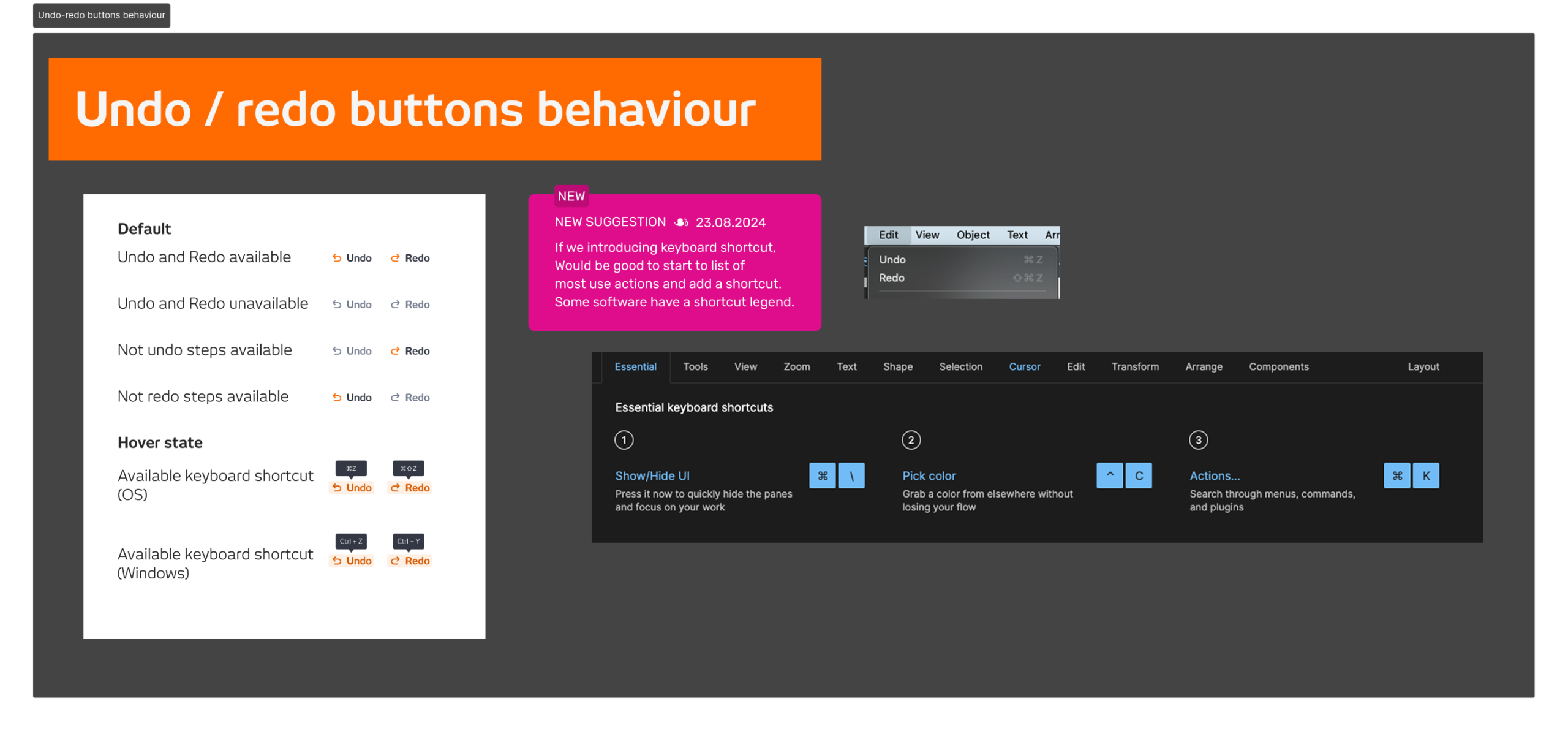
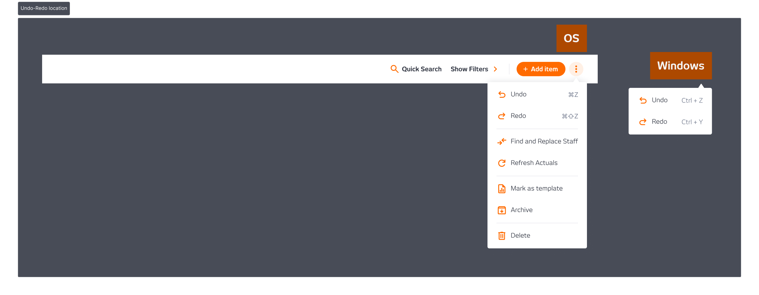
The placement decision was the most considered part of the design. The obvious choice was to surface undo and redo above the table, always visible, always accessible. But real estate was limited across different views, and consistency across the platform was a hard constraint. The first option didn’t work everywhere. The final decision was to place it in the more options menu, less prominent, but consistent across every context where it needed to appear.
I pushed for an A/B test to validate the placement decision. The team didn’t have the capacity to run it, so we went with one version and monitored from there.
OUTCOME
No significant feedback after launch, which for a feature like undo and redo is the right outcome. When it works, users don’t notice it. They just stop getting stuck. The absence of complaints was the signal that the feature was doing its job.
Company
SCOPE Better
Year
2024
Design Tools
Figma and Miro