Financials at a glance •
SCOPE Better is a CPQ platform. Pricing is the whole point. But the financial summary (margin, total cost, fees, resources) lived at the bottom of the page, below hundreds of rows of scope data. Nobody had flagged it as a pain point. But if your product is about pricing, the price shouldn’t be the hardest thing to find. The Financials block didn’t arrive fully formed. It started as a simple card row in Scope by Work, and evolved into something more complete when Scope by Timeline created new space and new needs.
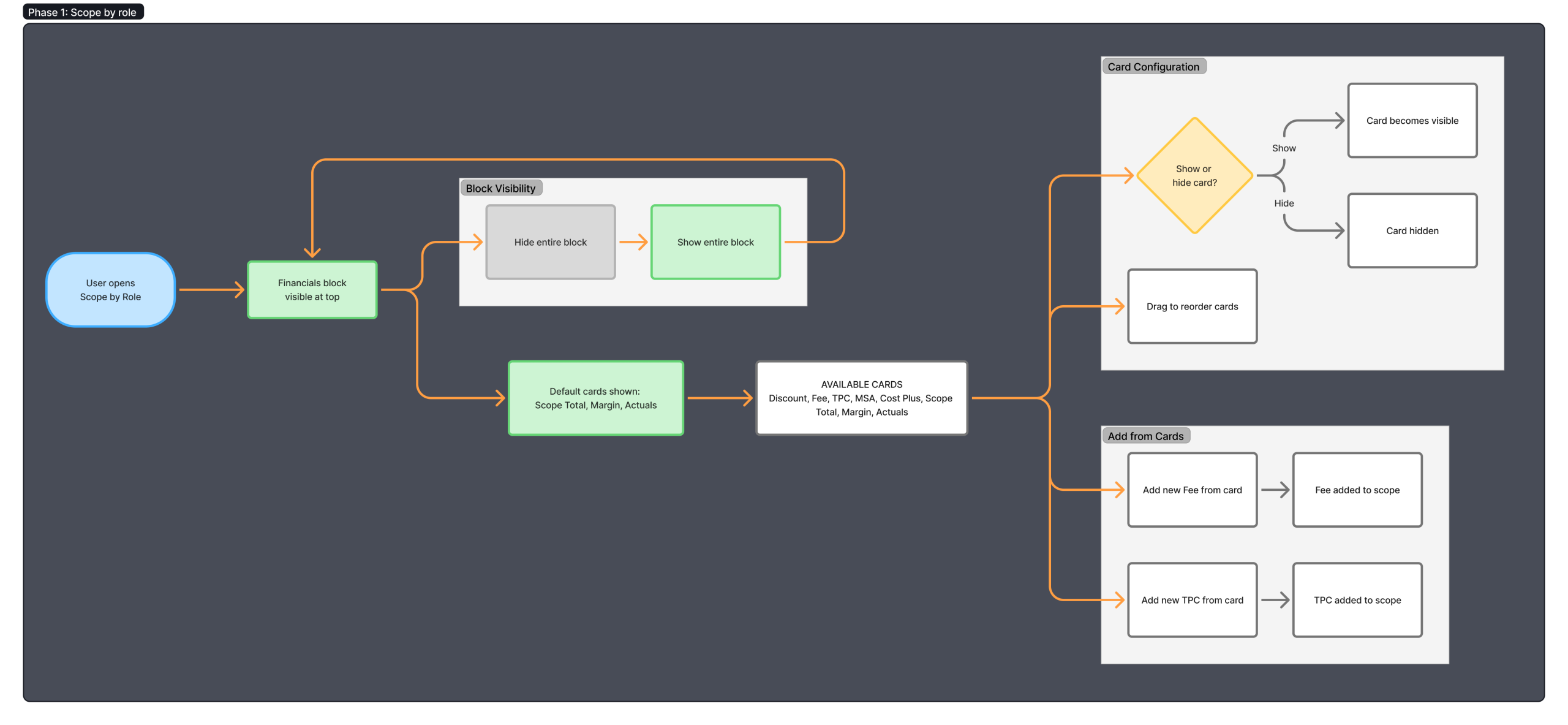
PHASE 1: SCOPE BY ROLE
The first version came out of a platform audit while designing the Scope by Role/Task redesign. Looking at the page as a whole, the question was simple: what is the user actually trying to find out? The answer was always the same: how much is this going to cost, and how much are we going to earn.
That information existed. It was just in the wrong place. Beyond the scroll issue, the platform still felt like an Excel file. Moving the financials to the top of the page was as much about making SCOPE Better feel like software as it was about fixing a scroll problem.
I sketched the concept quickly and introduced it directly into the wireframes as part of the full Scope by Work flow. The logic was simple enough to explain in a sentence: the outcome of scoping is a price, so show it at the top.
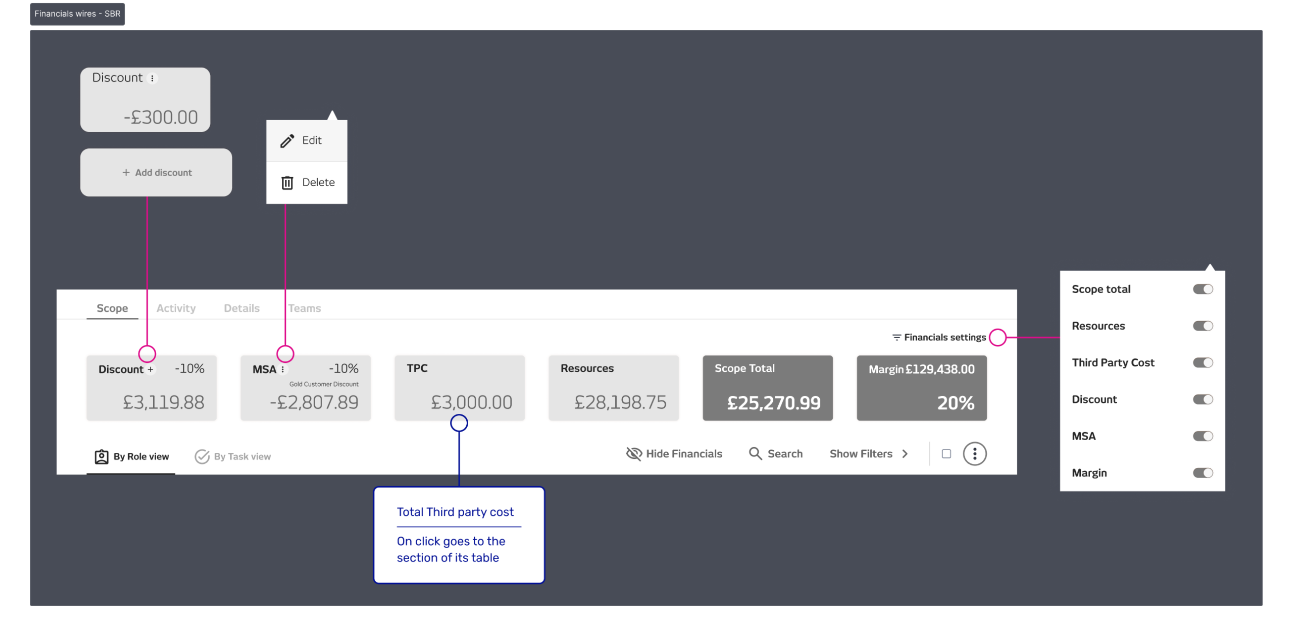
The first version was a row of configurable cards: Scope total, Margin, Resources cost, TPC, Fees, Discounts, MSA, Cost Plus, and FTE. Users could show, hide, and reorder individual cards based on what mattered most to their workflow. Depending on the permission level, certain values were editable directly from the block. The block was collapsible when users needed more room to work in the table below.
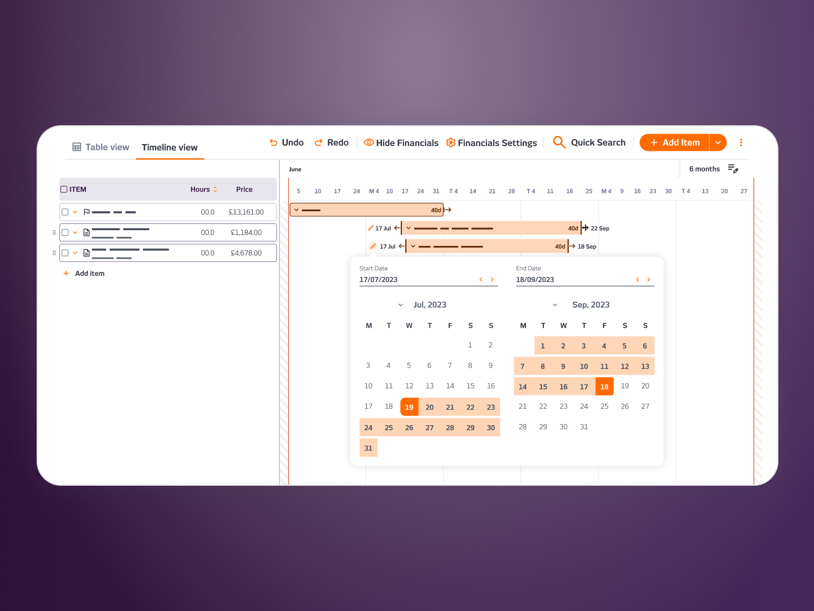
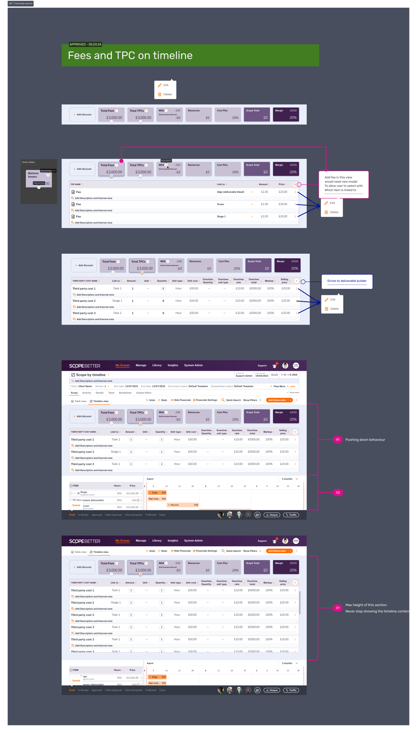
PHASE 2: SCOPE BY TIMELINE
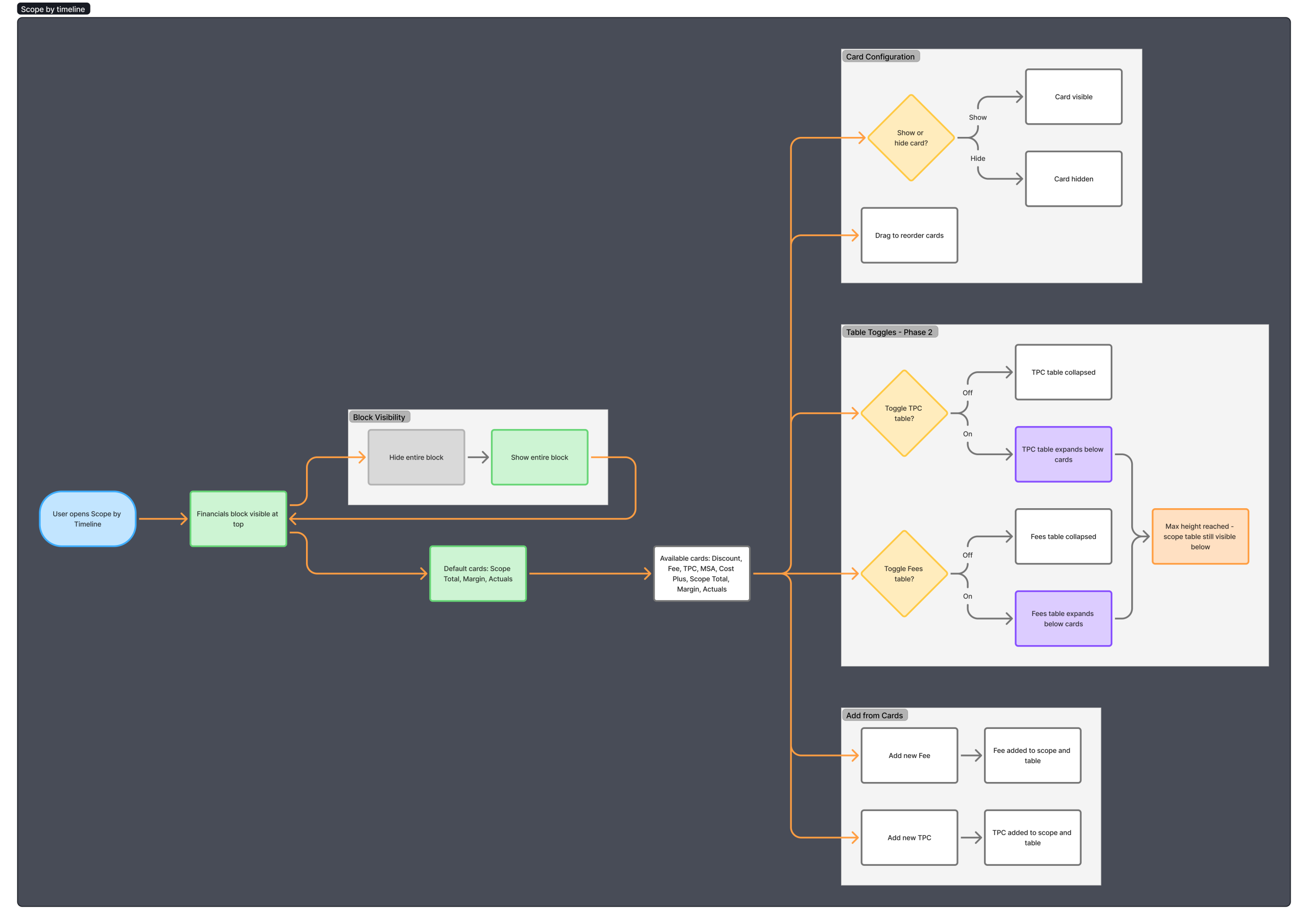
When Scope by Timeline was being designed, the Financials block came with it, but the new view surfaced a gap. The cards gave a good summary, but Fees and TPC were more complex than a single number could communicate. Agencies needed to see the breakdown, line items, quantities, amounts, without leaving the financial context or digging into the table below.
My call was to extend the block. Fees and TPC each got their own expandable table within the block, sitting beneath the summary cards and pushing the scope table or Gantt chart down with a maximum height so the user could always see a bit of the working area on screen. The collapsible behaviour stayed the same; users could hide the entire block to reclaim real estate when they needed to focus.
The block now had two modes: summary view for a quick read of the numbers, and expanded view for the detail behind them. Same component, same position, more depth.
OUTCOME
Stakeholders understood the value immediately, not because they had identified the problem themselves, but because the solution made the problem obvious. Clients responded to it as a sign the platform was maturing, less spreadsheet, more software. The evolution from Phase 1 to Phase 2 happened naturally because the feature was designed with enough flexibility to grow without being rebuilt.
Company
SCOPE Better
Year
2023-24
Design Tools
Figma and Miro