
Filters •
The filter tool was one of those problems that was obvious the moment you used it. Dropdowns stacking vertically, no sense of where they ended, too many options with no clear hierarchy, and different behaviour depending on where you were in the platform. Users said they struggled with it. When I first opened it myself, I immediately understood why; it was overwhelming before you had even selected anything. ⤵
DISCOVERY
Before touching any designs, I mapped every filter across every section of the platform (My Scopes, Scope Overview, Library Items, Dashboard, and Reporting), documenting what existed, what was missing, and where things were inconsistent. I confirmed the mapping with the PM and engineering to make sure nothing was being missed or misunderstood.
What came back was a platform where filters had grown organically without a shared logic. The same data point had different filter mechanisms in different sections; some filters were redundant, others were missing entirely, and the vertical dropdown layout meant users had to scroll through an ever-growing list with no sense of progress or structure.
One technical constraint shaped the search filter specifically: typing was causing high performance impact on queries, so engineering needed a short delay before the query fired. I kept the design intent intact, and the constraint was handled on the build side without compromising the experience.
WHAT I DID
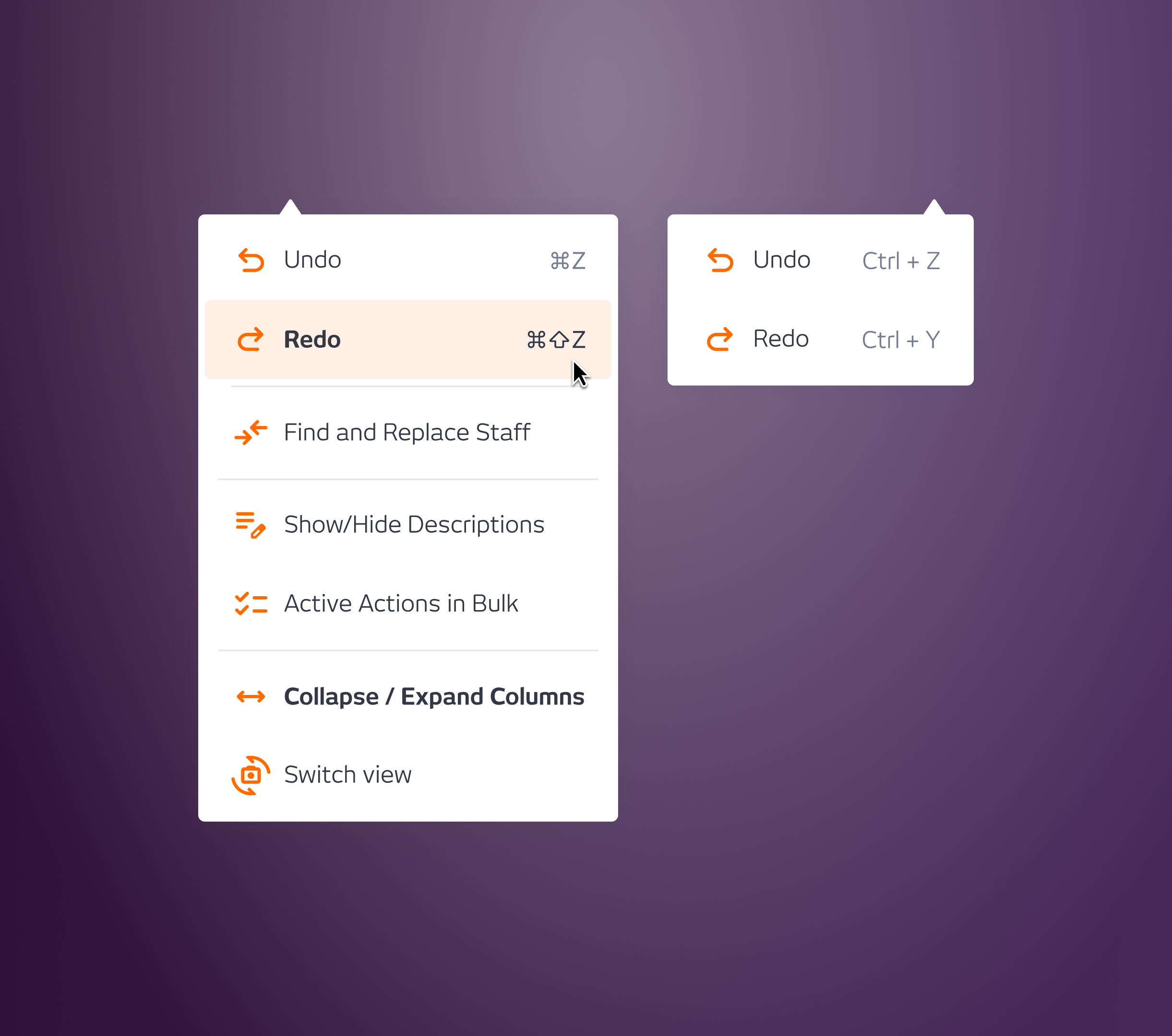
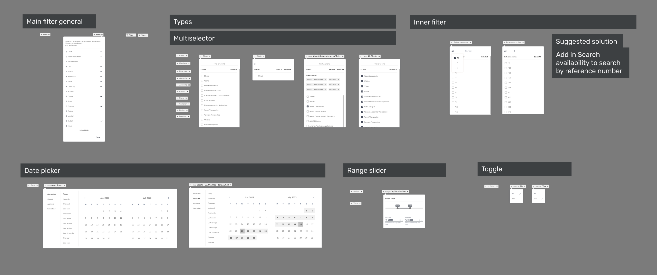
With the full map of filters across the platform, I defined the right mechanism for each type of metadata: multi-selector for list-based filters, date picker for date fields, range slider for quantities and budgets, radio buttons where the filter needed to be mutually exclusive, and inner filters for anything requiring a more granular second level of selection.
I designed three rounds of wireframes, each refined based on stakeholder feedback; some mechanisms weren’t landing, some metadata categories were missing, and a few filter groupings needed rethinking. By the third round, the structure was stable enough to move to hi-fi.
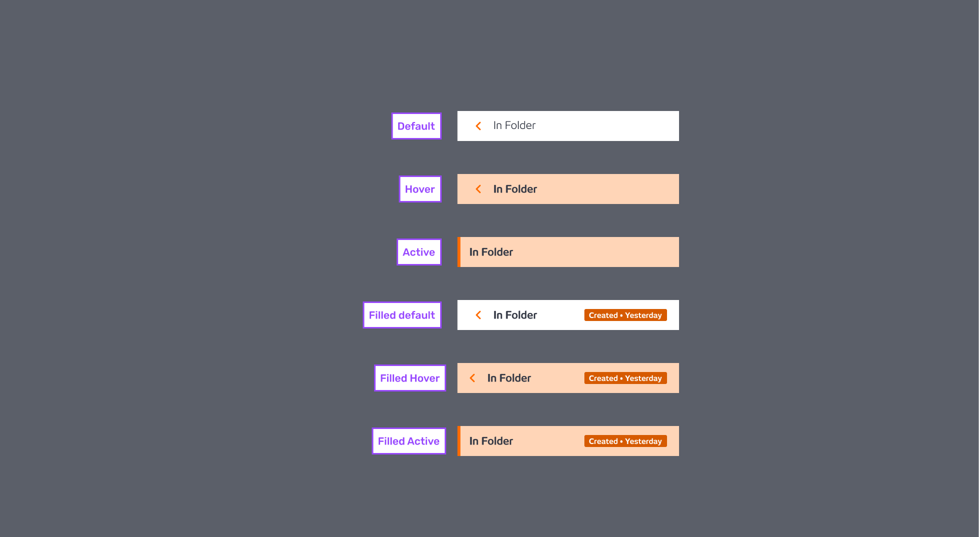
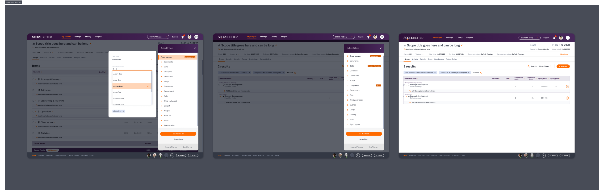
For the container itself, I designed two versions. The first was a drawer anchored to the left and bottom edges of the screen, with filters displayed vertically and action buttons fixed at the bottom. The second was a fully floating panel on the right side of the screen, with filters laid out horizontally to use the full width, and actions again fixed at the bottom so users never had to scroll to find them. Both kept the filter experience contained and separate from the page content underneath.
We went with the floating horizontal version. It used the screen space more efficiently, kept the filters scannable without scrolling, and felt less like it was competing with the content behind it. It launched as a platform-wide update, one consistent filter experience across every section at once.
OUTCOME
Stakeholders responded well, and users found it easier to navigate. The most consistent feedback was that it finally felt manageable. No metrics, but the qualitative shift was clear: the filter tool went from something people avoided to something that worked the way they expected it to.

Filters are one of those features that are invisible when they work and painful when they don’t. Getting them right meant starting with the full picture, mapping everything that existed before deciding what to change.
Company
SCOPE Better
Year
2023
Design Tools
Figma and Miro