SCOPE Better Design System •
SCOPE Better’s platform had grown fast without a design foundation to match. UIs drifted across screens, components were duplicated everywhere, and handoffs between design and engineering dragged on. Every new feature started from scratch. It wasn’t scalable, and everyone felt it; they just hadn’t yet agreed on what to do about it. So I took the initiative to build their design system while working on the New vision of the platform.
faster design–dev handoff
increase in reusable components
quicker feedback cycles
components in central library
DISCOVERY
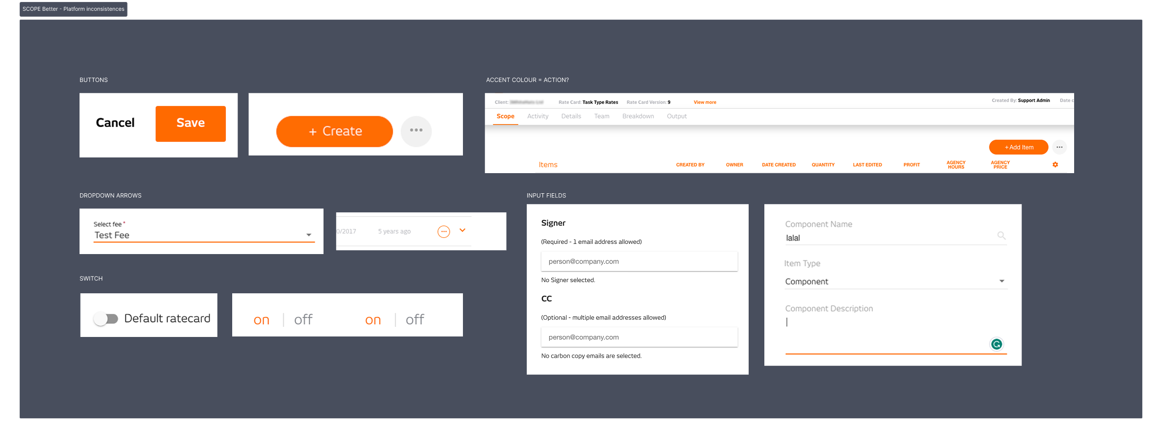
I started with an audit of 100+ screens, mapping every table, modal, menu, and form variation across the product. Then I ran stakeholder interviews to understand where handoffs were breaking down and what was costing the engineering team the most time. The picture that emerged was clear: there was no shared source of truth, and every designer and developer was making their own decisions in isolation.
BUILDING THE CASE INTERNALLY
A design system was not even contemplated on the Roadmap. I built the case for it by showing the cost of not having one, mapping the time lost to duplicated components, inconsistent handoffs, and rework, and putting that in front of the product and engineering leads. Once the numbers were visible, the conversation changed.
The timing mattered too. The platform was mid-migration from one Angular framework to another, which was a rare window to rebuild components correctly rather than carry the mess into the new system. I pushed for the design system to run alongside the migration so we would only have to do it once.
The goal was never just cleaner handoffs. It was a Figma component library that designers could recycle instead of rebuilding from scratch, an Angular component library that engineers could implement directly, and documentation clear enough that any new designer or engineer could onboard with minimal ramp-up. Built to outlast me and to speed up everyone who came after.
WHAT I DID
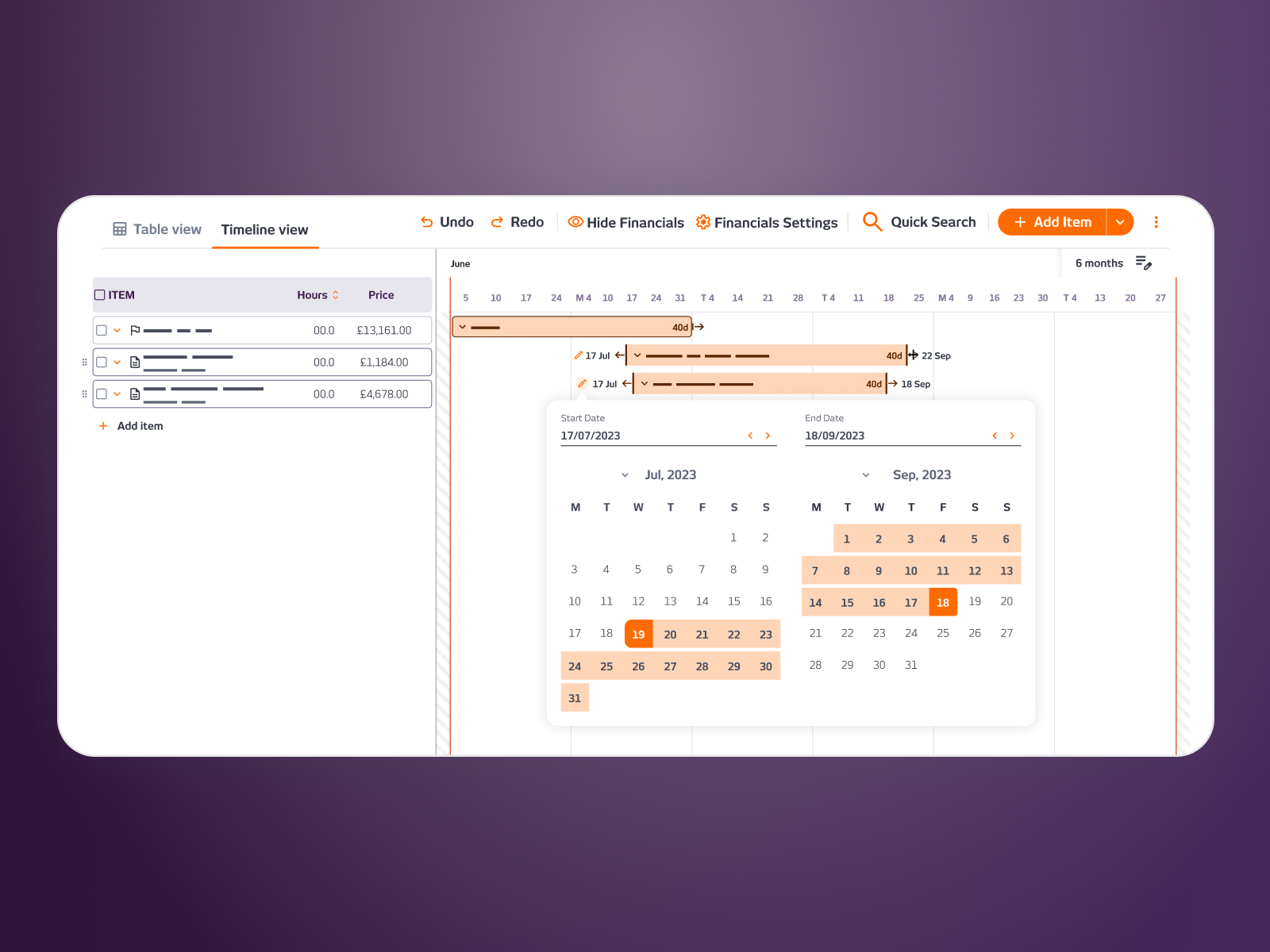
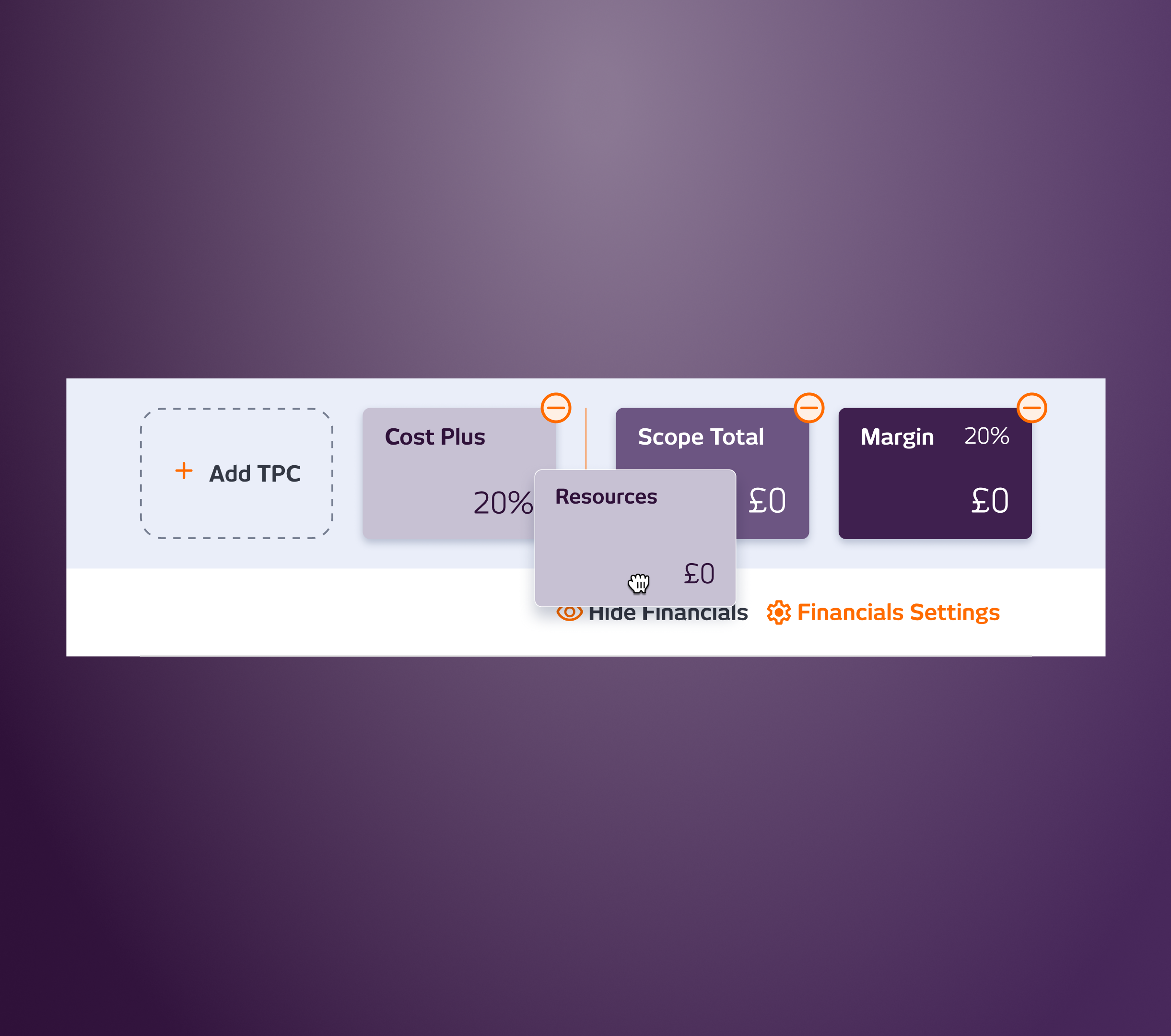
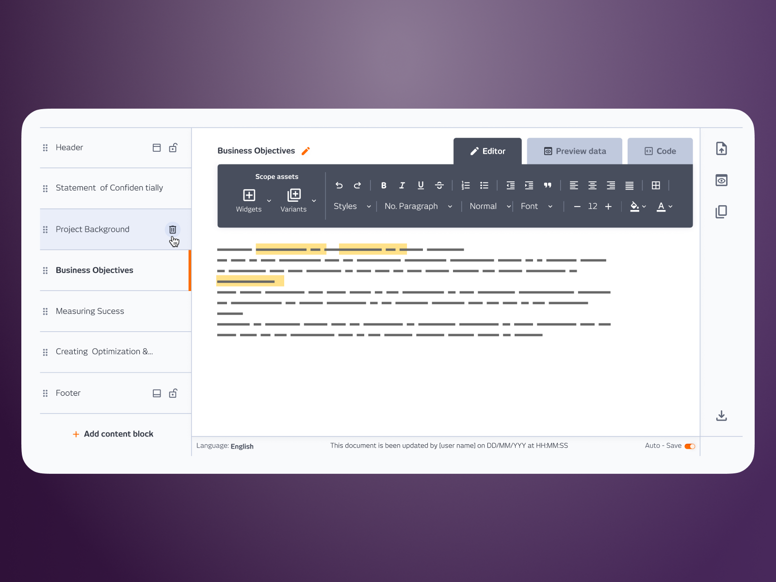
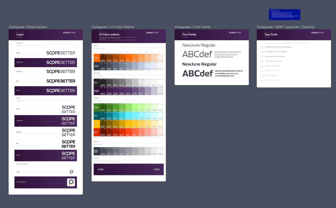
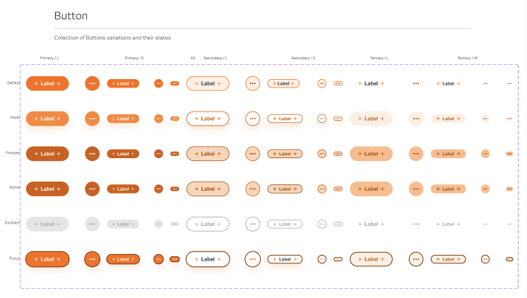
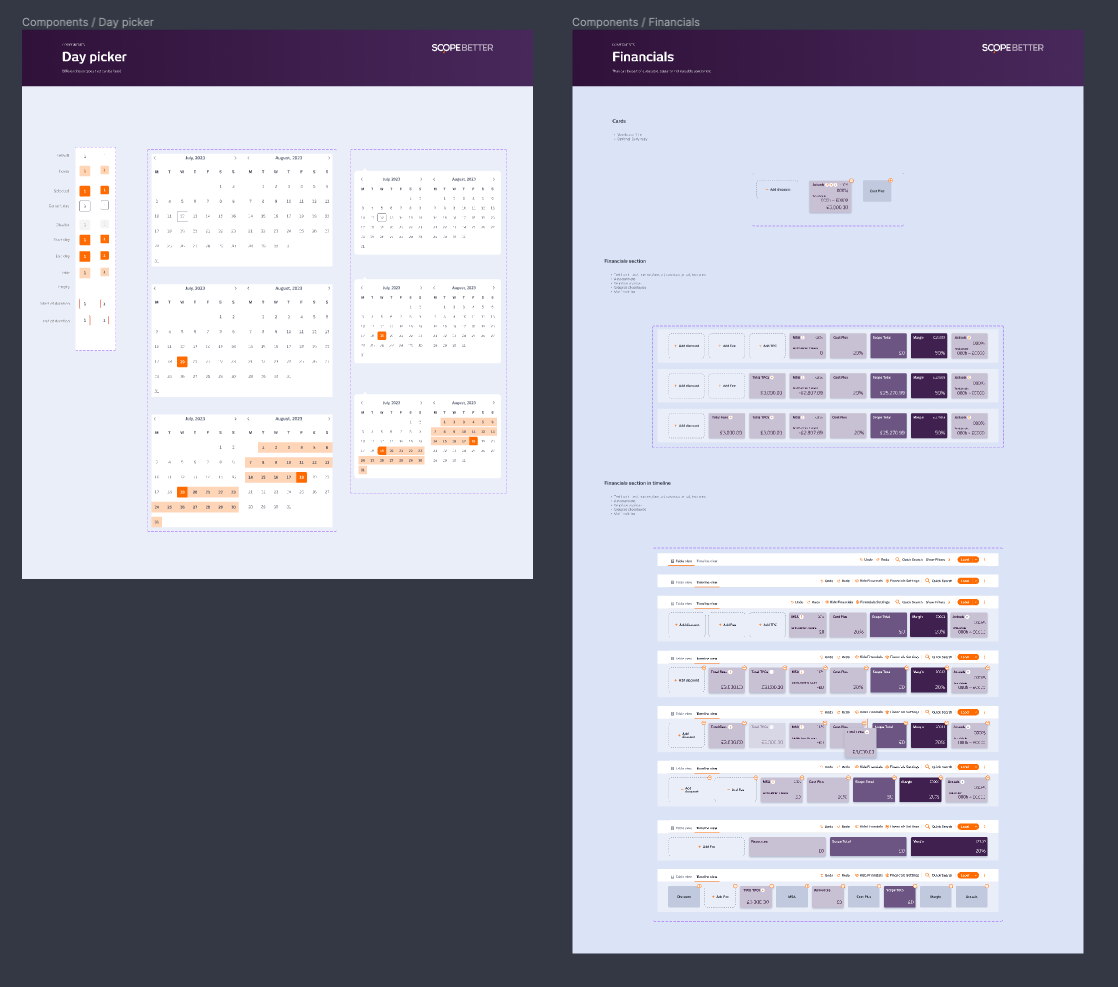
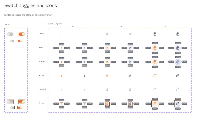
I architected a token-based design system in Figma, linked it to a living Storybook library, and introduced it incrementally, rolling it out on real product screens rather than as a big-bang replacement. I paired the system with clear documentation and ran regular cross-team workshops so engineers understood the logic behind the components, not just how to use them. The system was designed to survive beyond my involvement; every decision was documented, and every pattern had a rationale.
OUTCOME
From the start, the handoff time dropped by 40%. Reusable components tripled. Feedback cycles halved. The library grew to 80+ components and became the foundation for every new feature built on the platform, including the CPQ redesign, Find and Replace, and the 0-to-1 features that followed.