
Scope by Timeline .
SCOPE Better scopes can run to hundreds of nested rows. When a user spotted a single role appearing across 105 components, the only way to fix it was to scroll through every one and change it manually. It could take hours. And it was easy to miss something. Users needed Ctrl+F easy to find and use.
DISCOVERY
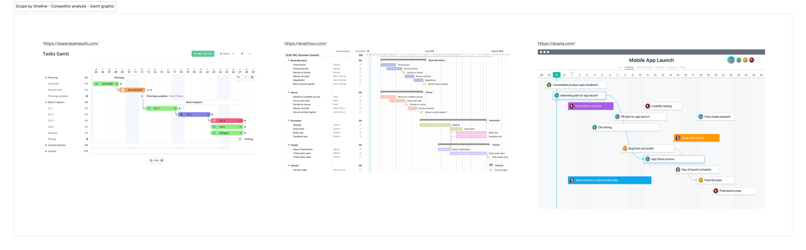
The brief was clear enough that I didn’t need to run user interviews. Instead, I analysed how other tools handle time-based project planning (Teamwork, Everhour, and Asana), focusing on how they let users visualise and edit time directly on a Gantt graph view. The patterns were consistent enough to give me a solid starting point. I moved straight to wireframes.
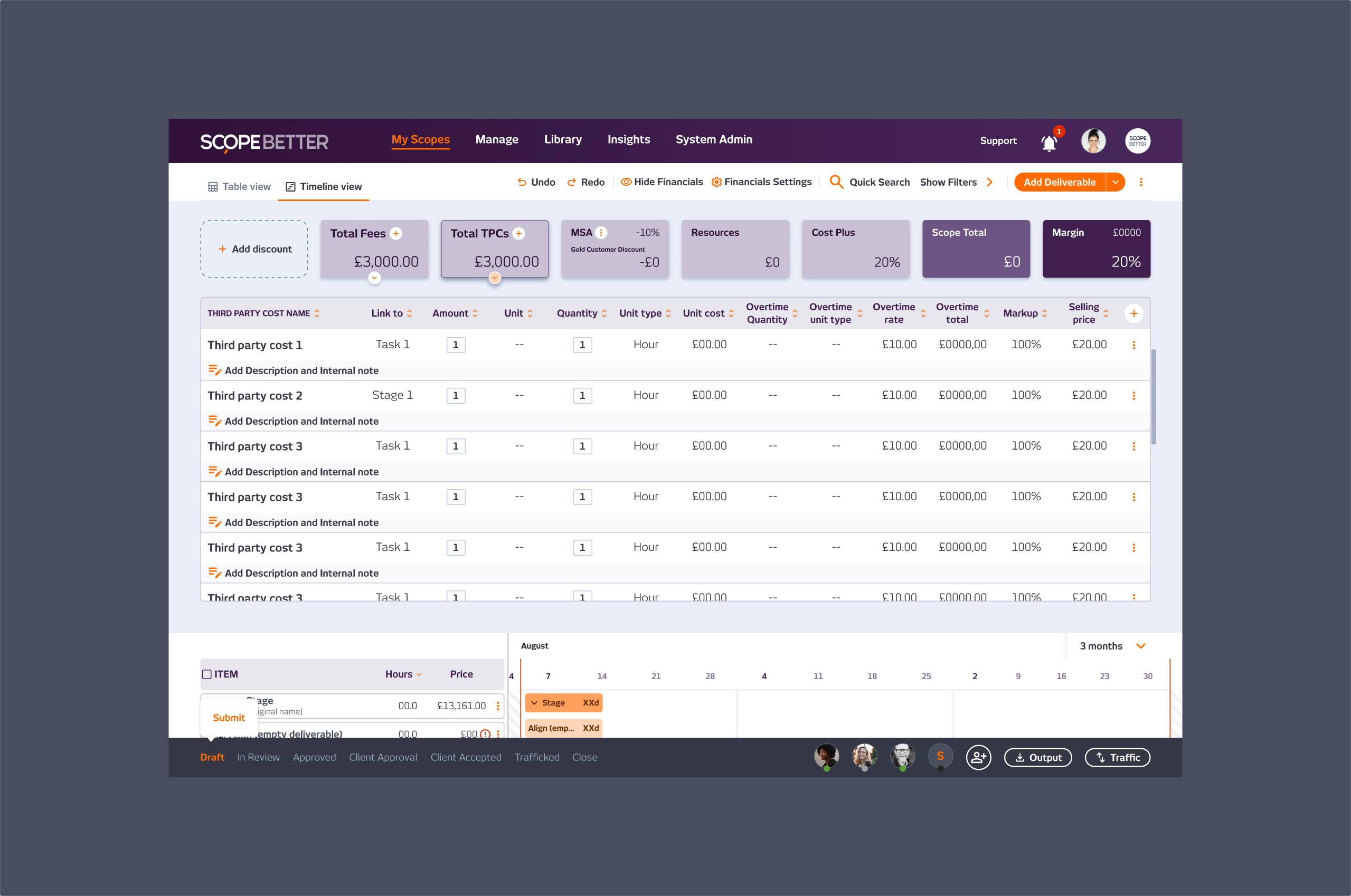
One thing that came out of that research had nothing to do with the timeline itself. Looking at how those tools surfaced key financial data, it became obvious that SCOPE Better had the same problem in reverse: the most important information on a scope, total cost, hours, and margin was buried at the bottom of the page like a spreadsheet footer. That observation eventually became its own feature.
WHAT I DID
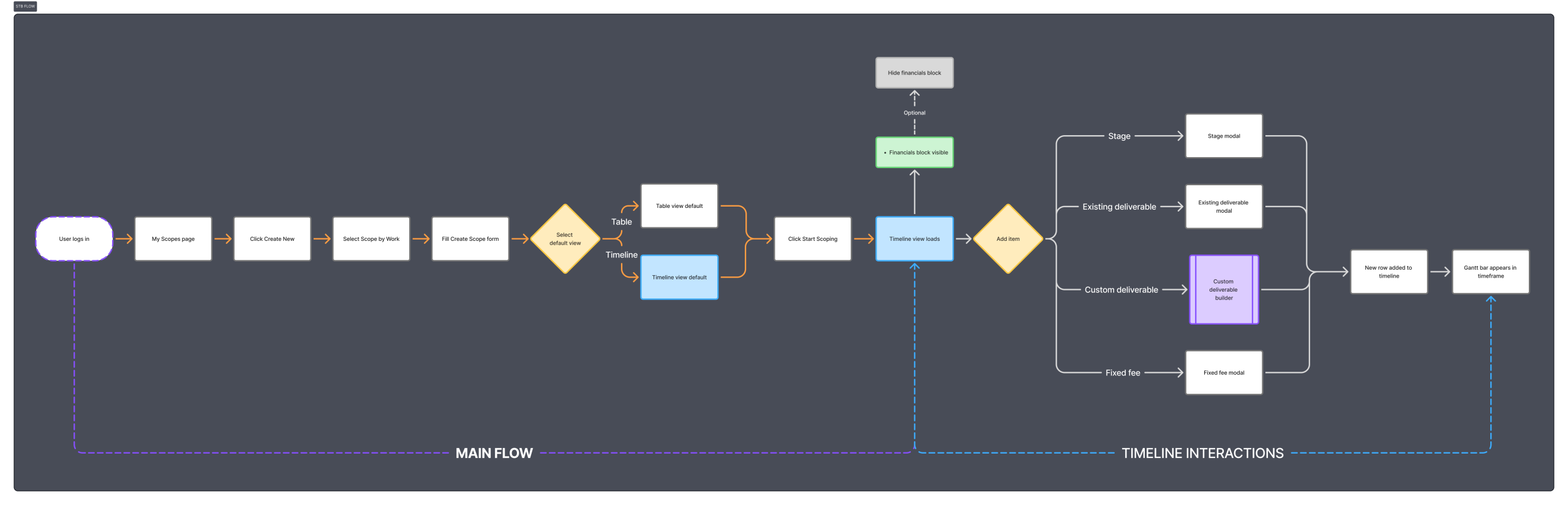
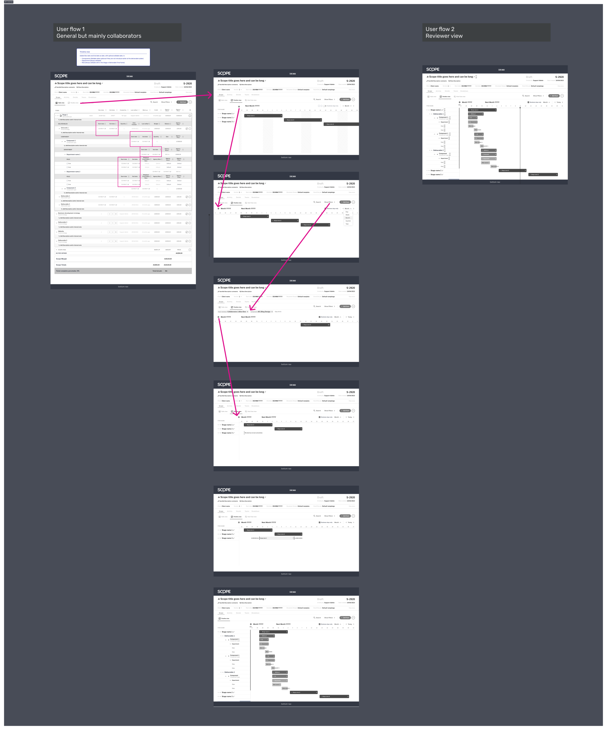
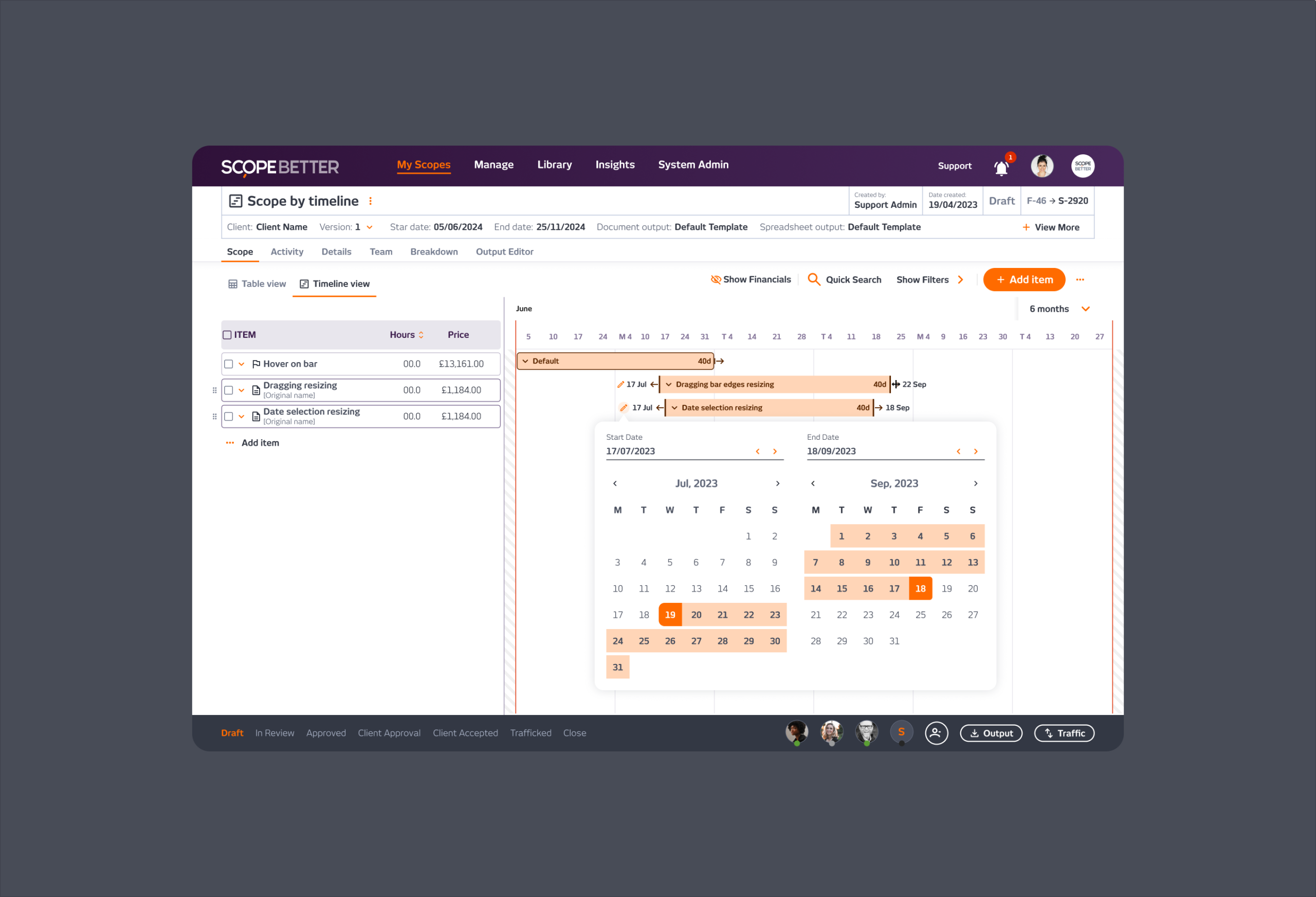
I translated the existing Scope by Work table into an editable timeline format. Each row in the table (deliverable, component, stage) had a corresponding bar on the timeline. Users could drag to adjust the timeframe, edit start and end dates directly, and view all the information they needed without leaving the timeline: name, scope number, hours, cost, and timeframe.
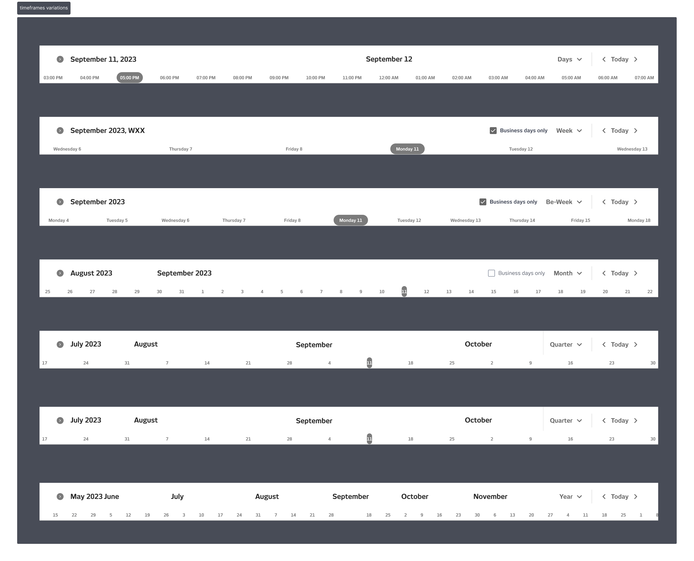
The timeline and the table stayed in sync. Any edit to the timeline automatically updates the Scope by Work view, and vice versa. The selectable time view (days, weeks, bi-weekly, monthly) gave users control over the level of detail depending on the project length.
The vision for the product was to be a Swiss knife scoping tool, with multiple ways to scope the same project. In practice, the engineering complexity of managing different mandatory data inputs across different scoping methods was too high to deliver cleanly. So, Scope by Timeline became a view of Scope by Work rather than a standalone scoping method; the timeframe was already a required input when creating a new scope, which made the transition logical and technically manageable.
TPC and Fees were descope from the timeline view; that data lived in Scope by Work and in the Financials block, so users could access it without cluttering the timeline itself.
OUTCOME
Design took three weeks. The build took one month. Client validation during the process was positive; agencies responded immediately to having a visual way to see and adjust their project timing. Adoption was limited by the size of the user base at the time, not by the feature itself.
The feature never shipped in its complete form; engineering priorities shifted before the final elements were built. But the core of it worked, clients valued it, and the research that informed it led directly to one of the most impactful changes made to the platform.
Company
SCOPE Better
Year
2024
Design Tools
Figma and Miro


