Integrations •
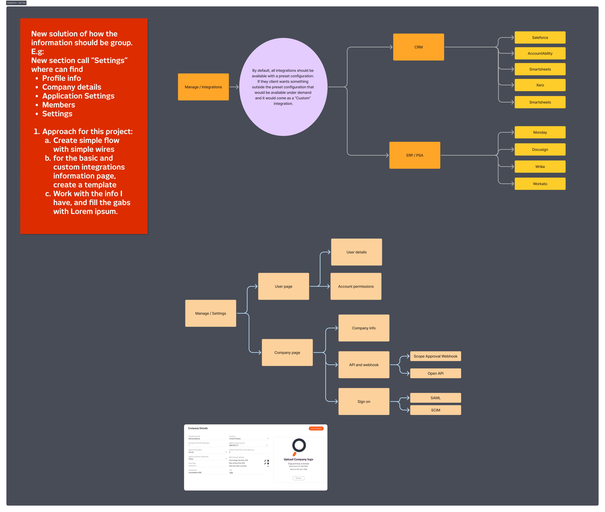
SCOPE Better’s integrations connect other clients’ tools like Salesforce, Xero, DocuSign, Monday, and others, but the way they were presented didn’t serve users or reflect the business model clearly. Standard integrations included in the base fee sat alongside custom integrations with their own pricing, with nothing to distinguish them. Users couldn’t easily tell what they had access to, what would cost extra, or how to set anything up. The Manage section itself had a broader IA problem: a flat navigation mixing account details, configuration, and integrations without any logical grouping.⤵
DISCOVERY
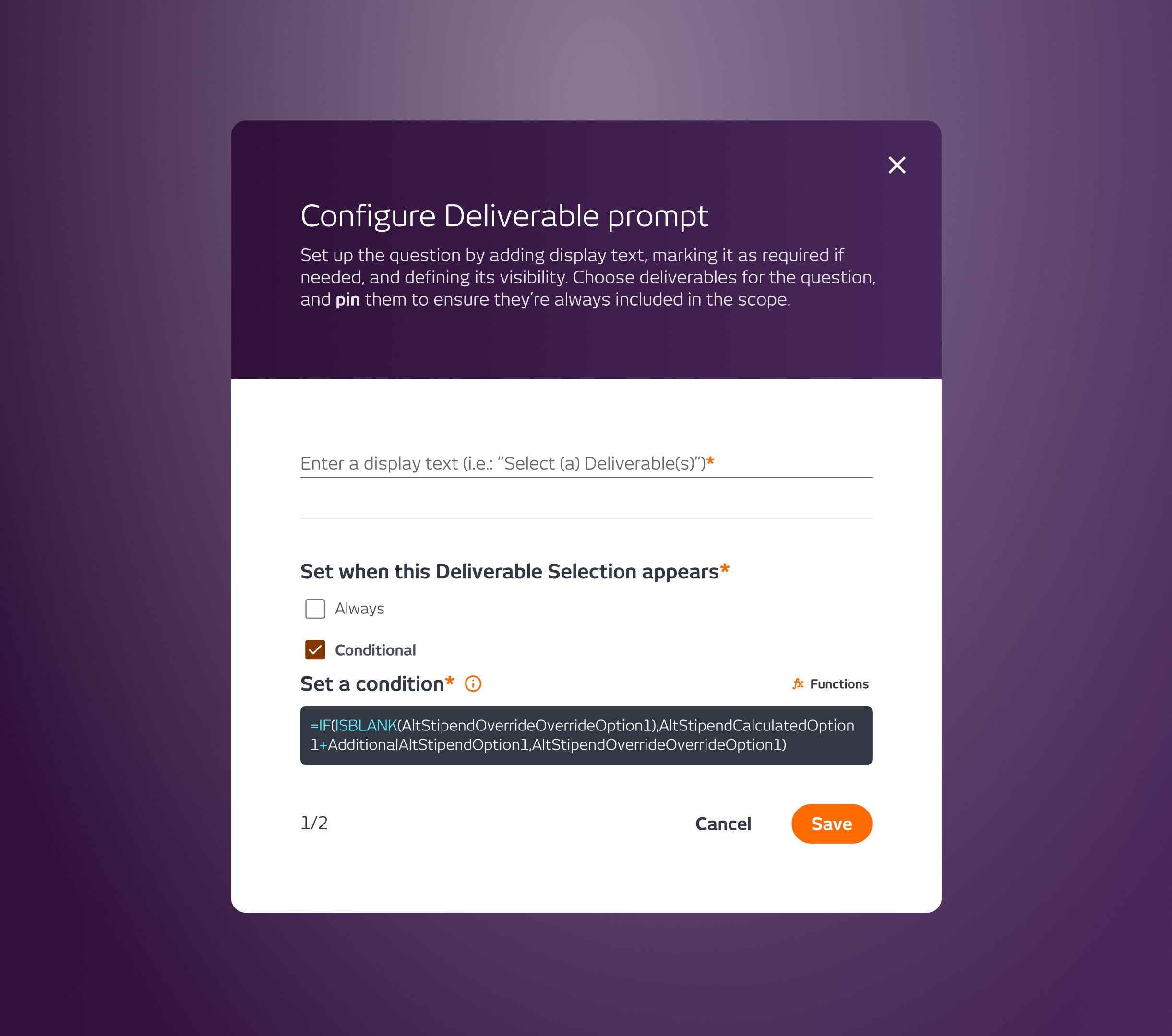
Before touching the integrations themselves, I looked at the Manage section as a whole. The navigation was a long flat list with no grouping or hierarchy, related things weren’t together, and users had to scan everything to find what they needed. My recommendation was to restructure around themes: Settings as a parent section grouping Profile, Company Details, Application Settings, and Members together. Information and configuration grouped by subject, not scattered across a flat nav.
For the integrations themselves, I looked at how PandaDoc, Zoom, and Figma handle the same challenge: a growing library of third-party connections that needs to be scannable, informative, and actionable. Those three set the reference point.
WHAT I DID
I mapped the full integration architecture, two categories, CRM and ERP/PSA, each with a set of supported platforms, and defined the logic for how integrations should behave by default. All integrations would be available with a preset configuration. Anything outside that preset would be flagged as a custom integration with its own fee, making the pricing distinction visible and clear from the start.
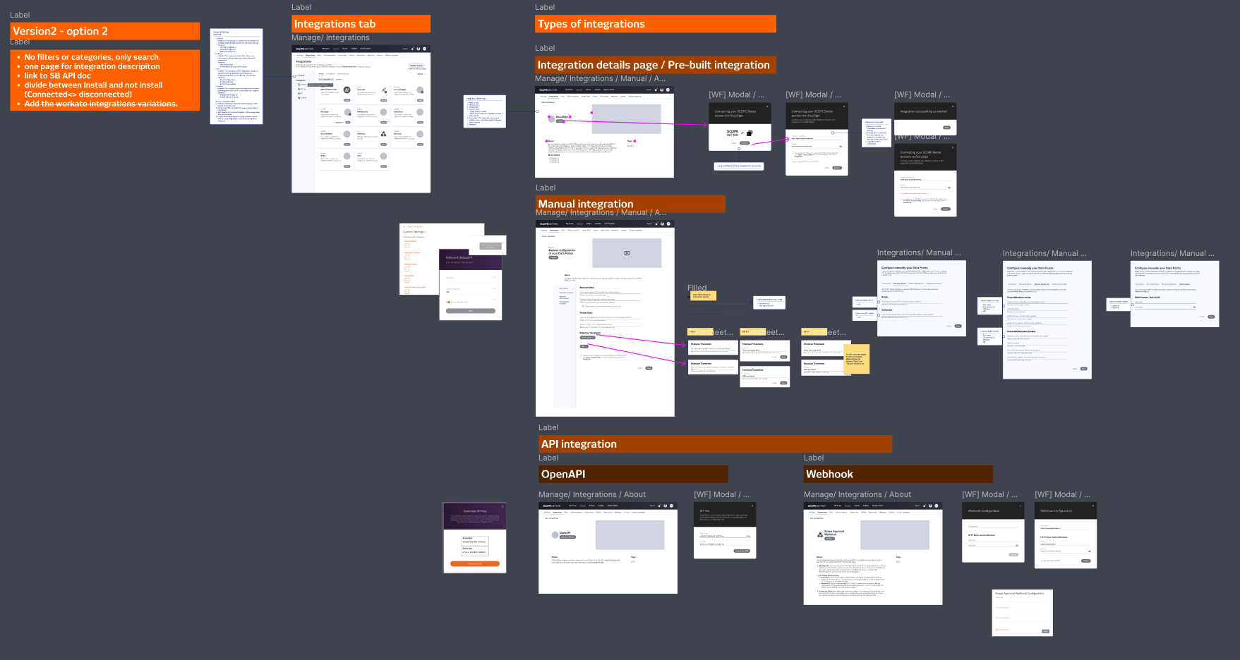
I designed two versions of the integration detail page, one that opened in a new page, one that stayed on the same page. The new page option won: keeping everything on one page risked too much clutter given the amount of information each integration needed to surface. The detail page structure covered the platform logo, name, install button, an image or video showing how the integration worked, a full description with instructions and benefits, and a taxonomy tag to help users find integrations by category. The approach also accounted for three installation types: automatic, manual, and API, and included a way to associate each integration with the specific clients who had it connected.
The work reached the wireframing and architecture stage before being deprioritised. Scenario Pricing became the immediate focus, and there were technical blockers on the engineering side that needed resolving before the integration build could begin.
OUTCOME
No hi-fi designs or prototypes were done; this is a work in progress, paused at the architecture and wireframe stage. The foundation is solid: the IA recommendation, the integration taxonomy, the detail page structure, and the preset versus custom distinction are all defined and ready to move forward when the project resumes.
Company
SCOPE Better
Year
2024
Design Tools
Figma and Miro