Making SCOPE Better a product •
SCOPE Better worked. The logic was there, the features were being built, and clients were using it. But it didn’t feel like a product; it felt like a very functional wireframe. Spacing was inconsistent, colours were arbitrary, actions weren’t obvious, and the overall impression was of something that hadn’t quite been finished. Client feedback pointed in a consistent direction: the platform felt cluttered, some workflows felt slow, and outputs needed more manual work than they should. The platform needed to grow up.
FRAMING THE PROBLEM
There was no formal research cycle to lean on, so I built the case differently. I took the client feedback that already existed, ran my own audit of the platform, and identified where the biggest gains were hiding. Then instead of writing a proposal, I showed it: a few updated screens side by side with the originals. The before/after did the arguing for me. The platform could look more mature and feel easier to use without rebuilding anything from scratch — and once stakeholders saw it, the conversation changed from whether to when.
The timing mattered too. The Angular migration meant every section of the platform was going to be touched anyway. Pairing the visual uplift with the migration and the design system I was building meant three workstreams reinforcing each other — components rebuilt once, correctly, and applied consistently as each section was updated.
THE THINKING
The approach stayed the same across 11 months: apply usability and accessibility principles, compress unnecessary spacing, establish consistent colour usage, clarify actions, and add enough visual guidance that users never had to figure out what to do next.
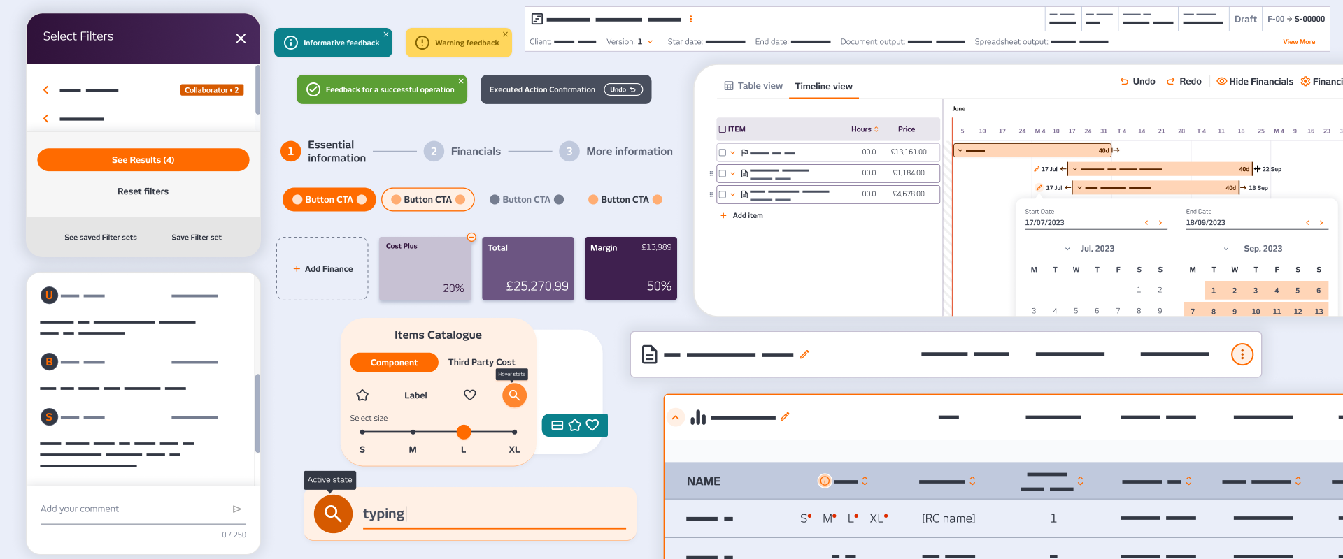
Scope by Work was tackled first and became the template for everything after. The table was compressed to recover real estate without losing readability. Orange became the action colour, applied deliberately, not decoratively. Toggles replaced ambiguous controls. Menus were cleaned up. Modals were rewritten to explain what each field was for and what would happen next.
No single screen changed dramatically. The difference was cumulative, each change small, together shifting the platform from unfinished to considered. The Breakdown tab tells the story in one image: the original read like a spreadsheet mockup; the updated version read like software.
OUTCOME
The reaction was immediate. A client messaged directly after seeing the updated Scope Overview: ‘The new overview page looks AMAZING!!!!! Love it!!!’ The founder messaged during a company all-hands: lots of praise, ‘thank you for your efforts, care and attention.’ The platform became something people were proud to show clients rather than apologise for, and the visual maturity became part of the sales conversation during a period when the company was bringing on new clients.
Company
SCOPE Better
Year
2023-24
Design Tools
Figma and Miro